Eh, I don't like it, sorry.
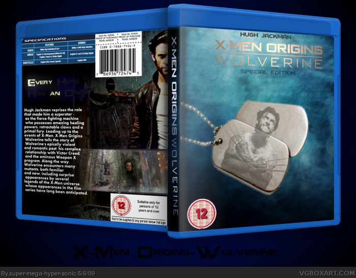
The logo on the front is too bright, maybe because of the gradient. The dog tags aren't a very good idea, to be honest, and the front in general is a little too boring, unless you were going for a minimal design. As for the back, only to words for the tagline are visible, the font isn't a very good choice for the description, and the screenshot bar isn't very well faded.
 X-Men Origins: Wolverine Box Cover Comments
Eh, I don't like it, sorry.
The logo on the front is too bright, maybe because of the gradient. The dog tags aren't a very good idea, to be honest, and the front in general is a little too boring, unless you were going for a minimal design. As for the back, only to words for the tagline are visible, the font isn't a very good choice for the description, and the screenshot bar isn't very well faded.
Edited at 1 decade ago
[ Reply ]
Cred to pr for renders and ADFD also IGN.com
and lets not forget SilentMan 101!
#1,I kinda was going for minimalistic...
Edited at 1 decade ago
[ Reply ]
I understand you were going for minimalistic, but this is too plain, and not very good imo. sorry.
[ Reply ]
At the angle I look at it I thought it said "Every hero has an Onion" xD
[ Reply ]
#4, Lol
[ Reply ]
#4, That would make a cool parody...
...hmmmm...
[ Reply ]
#6, I'm making it befor you!
[ Reply ]
#7, Aw, come on, I need a project.
:P
[ Reply ]
Shall we collab it?
[ Reply ]
#9, Maybe...
[ Reply ]