Ok People use this render over and over and over again but I kinda like this. I like the blood splat and the way the render is hidden behind the title.
Ok People use this render over and over and over again but I kinda like this. I like the blood splat and the way the render is hidden behind the title.
Christ, enough about the reused art, who cares, really? Aslong as what's been done with the art is good. I mean, you can look at any MGS4 or any other famous box and see masses of virtually the same box. It's becoming an obsession.
Now that's out of the way, nice box - Just some things could do with improvement, like the layout of the back - and the logo on the front is a little hard to see, it needs to stand out more. The render of Ezio looks a little strange too, it's like his legs just dissappear, it needs to fade more. Good job on the presentation though.
My issue is this: the logo is really hard to read. It would look better in all black or all white and put the II centered in behind or something like that.
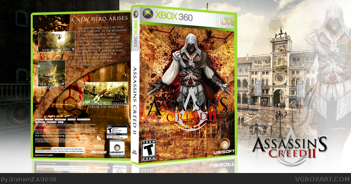
 Assasins Creed 2 Box Cover Comments
Well here is my Assassins creed 2 box, i just released its spelt wrong in the top but owell.
i know the render has been used a million times but its the only render for this game soo far.
so comments and faves are most appreciated.
[ Reply ]
The 3d aspect looks "off" for some reason. I like it, but everyone will hate you because you used the same render.
Edited at 1 decade ago
[ Reply ]
People should really stop doing these until there's more art.
[ Reply ]
#2, dont let it stop you from faving though :) lol
#3, yeah i was away when this art came out, and didn't realize people had already whored it.
[ Reply ]
Hot, hot, hottt.
[ Reply ]
thanks, little disappointed with the lack of comments.
comment more people!
[ Reply ]
Ok People use this render over and over and over again but I kinda like this. I like the blood splat and the way the render is hidden behind the title.
[ Reply ]
Ok People use this render over and over and over again but I kinda like this. I like the blood splat and the way the render is hidden behind the title.
[ Reply ]
Just so unbelievable awesome!!! +fav +author fav :D
Edited at 1 decade ago
[ Reply ]
Overused concept and lame tagline.
Edited at 1 decade ago
[ Reply ]
the tagline fits. and for the last time there are no other art for this.
[ Reply ]
Christ, enough about the reused art, who cares, really? Aslong as what's been done with the art is good. I mean, you can look at any MGS4 or any other famous box and see masses of virtually the same box. It's becoming an obsession.
Now that's out of the way, nice box - Just some things could do with improvement, like the layout of the back - and the logo on the front is a little hard to see, it needs to stand out more. The render of Ezio looks a little strange too, it's like his legs just dissappear, it needs to fade more. Good job on the presentation though.
[ Reply ]
My issue is this: the logo is really hard to read. It would look better in all black or all white and put the II centered in behind or something like that.
[ Reply ]
yeah well i think i shall update this soon as new art comes out.
[ Reply ]