I mostly agree with #1, but I do like the ghost [and roughly where you've put it] and the spotlight on Luigi thing.
I think it'd be quite cool if you could have the bottom left-hand corner [of the spotlight] look as though it's being sucked on by a hover and being dragged off in that direction. It could be kewl. Other than that, this really needs at least a ghoulish background and a better Wii template.
Those images are overused... Sorry. At least the Logo ist one of the best edits for "Luigis Mansion 2" on this page, but its effects are overdone on the spine. The real template would be way better as well and the spine seems a bit off on top. There seems to be a bulge at the upper part due to... I don't know what you made there, but it's not very well done.
oh and it may be just me, but Mario seems very stupid if he is back in that mansion and was captured again.
#5, how can they be overused when i rendered some? And thanks about the logo edit that means alot.
#6, i only just reilised that! lol
#7,thank you someone agrees about the critical judging! and thanks!
#8, They ARE overused. It's the same images again, and again, and again. I know, there is not much material for Luigi's Mansion, but it's getting old. There is a lot of other Luigi related material, so how about using these?
 Luigi's Mansion 2 Box Cover Comments
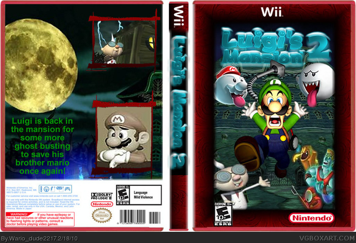
No.
The 2 is just some text, which doesn't fit...
The renders are badly placed,
No background?
Terrible template?
[ Reply ]
I mostly agree with #1, but I do like the ghost [and roughly where you've put it] and the spotlight on Luigi thing.
I think it'd be quite cool if you could have the bottom left-hand corner [of the spotlight] look as though it's being sucked on by a hover and being dragged off in that direction. It could be kewl. Other than that, this really needs at least a ghoulish background and a better Wii template.
Good luck in any future revisions!
[ Reply ]
logo is ok i guess and you did a nice job cutting out all the characters but, again to plain
[ Reply ]
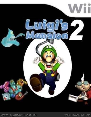
updated box:
credit:
logo - me
renders - Planet renders/me
Template - Someone?
i hope you enjoy the update
[ Reply ]
Those images are overused... Sorry. At least the Logo ist one of the best edits for "Luigis Mansion 2" on this page, but its effects are overdone on the spine. The real template would be way better as well and the spine seems a bit off on top. There seems to be a bulge at the upper part due to... I don't know what you made there, but it's not very well done.
oh and it may be just me, but Mario seems very stupid if he is back in that mansion and was captured again.
Edited at 1 decade ago
[ Reply ]
why is luigi kicking E.Gadd?
[ Reply ]
DANG! The people on this website sure are critical with the judging. Great box and impressive editing. Makes me wish it actually happened.
[ Reply ]
#5, how can they be overused when i rendered some? And thanks about the logo edit that means alot.
#6, i only just reilised that! lol
#7,thank you someone agrees about the critical judging! and thanks!
[ Reply ]
#7 & #8, If things aren't put across critically then people don't listen.
#8, The images can still be over used if you rendered them, they could be found in other places already rendered.
I'm not really fond of this, it seems a bit messy and that temp isn't very good at all IMO.
[ Reply ]
Use the REAL template.
[ Reply ]
Double post
Edited at 1 decade ago
[ Reply ]
#9, you are right people wouldn't listen.
#10, i am going to try and change the template to wii defult.
#11, the double post-ness of doom!!!
[ Reply ]
#8, They ARE overused. It's the same images again, and again, and again. I know, there is not much material for Luigi's Mansion, but it's getting old. There is a lot of other Luigi related material, so how about using these?
[ Reply ]
#13, ok but i wanted art from the game!
[ Reply ]
Way better than you first. There was a big change.
[ Reply ]