My newest box, comment and critique
I got some of the x-men from here\http://jjinbeat.com/Cap/StarSpangledSite/
check it out!
sorry for the blurryness but i can not fix that :(
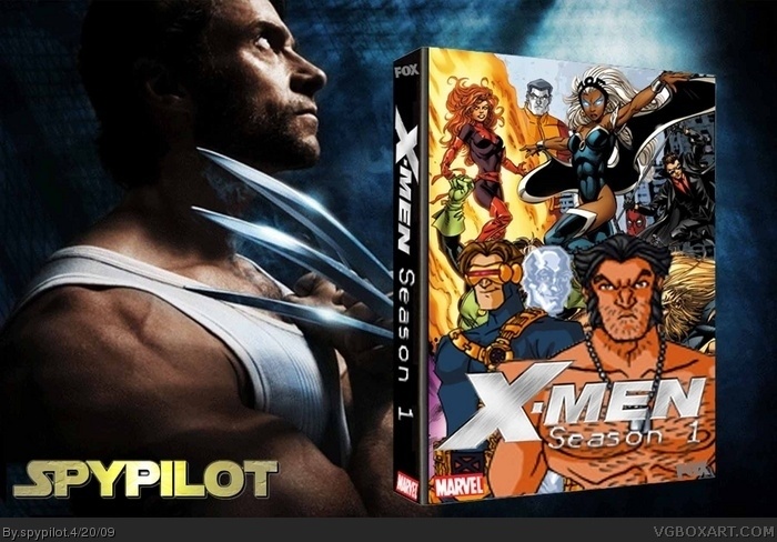
Movie Wolverine, as said, doesn't fit. There's also an issue with art styles clashing. Wolverine, Cyclops, and Colossus are the animated art style, while the other characters are clearly from the comic book artwork.
Clashing styles is a very bad idea. Other than that it's not bad.
ill change deadpool, collosus, wolverine, iceman and cyclops tomorrow (i do these at school during lunch) and as a side note, i put movie wolverine there as a background if u guys have a better one, give me a link! ;)
 X-Men: Season 1 Box Cover Comments
My newest box, comment and critique
I got some of the x-men from here\http://jjinbeat.com/Cap/StarSpangledSite/
check it out!
sorry for the blurryness but i can not fix that :(
Edited at 1 decade ago
[ Reply ]
Not bad. Low-Res.
Although I don't see the point of having movie wolverine there.
[ Reply ]
Movie Wolverine, as said, doesn't fit. There's also an issue with art styles clashing. Wolverine, Cyclops, and Colossus are the animated art style, while the other characters are clearly from the comic book artwork.
Clashing styles is a very bad idea. Other than that it's not bad.
[ Reply ]
I like it. If it were a higher-res, and wasn't clashing, I'd definitely fav it. Also, Deadpool's head looks weird sitting there.
[ Reply ]
ill change deadpool, collosus, wolverine, iceman and cyclops tomorrow (i do these at school during lunch) and as a side note, i put movie wolverine there as a background if u guys have a better one, give me a link! ;)
[ Reply ]
cool it just looks like a cool movie... +fav
[ Reply ]