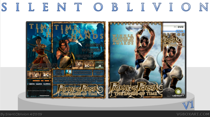
Here it is!
After scrapping my PoP 'Collection' boxart, I decided to got with single, limited editions for each of the trilogy.
Credit goes to qwerty for his ICO screenborders, which I adapted into the rims etc. Original PoP logo by Indexenos, editied into SoT by me.
Really nice box you have here man, but I really don't see why the ubisoft logo has to be green, the normal blue one would match the color scheme better.
 Prince Of Persia: The Sands Of Time Box Cover Comments
i like it.
[ Reply ]
Here it is!
After scrapping my PoP 'Collection' boxart, I decided to got with single, limited editions for each of the trilogy.
Credit goes to qwerty for his ICO screenborders, which I adapted into the rims etc. Original PoP logo by Indexenos, editied into SoT by me.
Well, not much else to say! :P
Enjoys!
[ Reply ]
OMFG
O.O.....
O.o...
Well....
I just blinded. Thats way too much.
[ Reply ]
Too much greatness.. This deserves the hall!!
[ Reply ]
gorgeous ;) but i do wonder how you make so manmy boxes and never ever have a bad design?
[ Reply ]
#5 - Always get bad designs =P
Like with this a had three other versions until I settled on this one xD
[ Reply ]
Nice box.
Edited at 1 decade ago
[ Reply ]
nice 9.5/10
+FAV
[ Reply ]
This should have more fav, its simply amazing.
[ Reply ]
Any more feedback, guys?
[ Reply ]
Really nice box you have here man, but I really don't see why the ubisoft logo has to be green, the normal blue one would match the color scheme better.
[ Reply ]
well done mate this looks great. :)
+fav
[ Reply ]
I came...xD
<3
[ Reply ]
Coooooooool!
[ Reply ]
Thats great! Fav.
[ Reply ]
now thats nice!
[ Reply ]
beautiful
[ Reply ]
I'm dreaming *pinches* OUCH! Maybe Not:P This is amazing, Fav.
[ Reply ]
*puts hands on face and jaw drops* fav
[ Reply ]