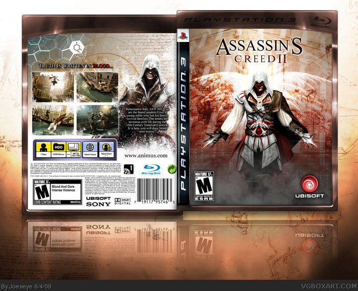
Did ypu use the same image of that character on the front and back? thats a bit lame...........everything else is good though I cant wait to hear more about this game I loved the first.
I sense an Assassin's Creed 2 box art overkill... Anyway, the only flaw I can find is the Ubisoft logo. You tried something there, but I'd say the original blue logo is just fine.
9/10
wats up dude, i like the back of the box, simply brilliant, but no offence i dont like the copperish edges of the box, unless its a special edition which would look very good! anyway love the box, keep up the awesome work. :D
 Assassin's Creed II Box Cover Comments
looks amazing! and those screenshots, bravo!
#4 ah thanks for clearing that up! at firs i thouht you had chosen one s from 1 that werent very obvious lol
Edited at 1 decade ago
[ Reply ]
There seriously are to many of these xD
Urgh, but this one looks good lol +fav
[ Reply ]
Wow, maybe people should wait until there's more material. But I guess this one looks really nice. :)
[ Reply ]
I want to hate the reuse of this art.
but I can't, cause this is awesome.
+fav.
[ Reply ]
Did ypu use the same image of that character on the front and back? thats a bit lame...........everything else is good though I cant wait to hear more about this game I loved the first.
[ Reply ]
Liking the red Ubisoft logo.
[ Reply ]
Now THAT is how you make a box.
[ Reply ]
May i officially give you your first rank 9+ fav?
[ Reply ]
Even though you've put ESRB's on PAL template this is still excellent.
[ Reply ]
I sense an Assassin's Creed 2 box art overkill... Anyway, the only flaw I can find is the Ubisoft logo. You tried something there, but I'd say the original blue logo is just fine.
9/10
[ Reply ]
I want this in the Gold HoF right now.
[ Reply ]
Awesome man, my favourite one yet.
BTW, I really hope that being in Venice you can swim, because falling into the water in the original AC sucked.
[ Reply ]
#22, I'm assuming you'll be able to swim, as you can see Ezio diving into water in the lower left screen.
Did I mention this box is awesome? Oh, I did. :)
[ Reply ]
DUDE! BRAVO!
[ Reply ]
Congratz!! You totally deserved it!
[ Reply ]
This is very nice box art. you made it so well that i thought it was the real box art!
[ Reply ]
This is very nice box art. you made it so well that i thought it was the real box art!
[ Reply ]
wats up dude, i like the back of the box, simply brilliant, but no offence i dont like the copperish edges of the box, unless its a special edition which would look very good! anyway love the box, keep up the awesome work. :D
[ Reply ]
That is beautiful. Wow, I'm blown away by the depth of it.
[ Reply ]
This box deserves MW. Let's get it in, it's definitely really close.
[ Reply ]