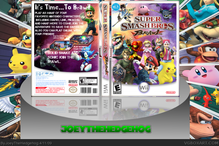
This took me sometime too make, and i put a lot of effort into it. hope you like it.
VIEW IN FULL VIEW!
~credit~
Koopadasher-template
Planet renders
Screen borders thread
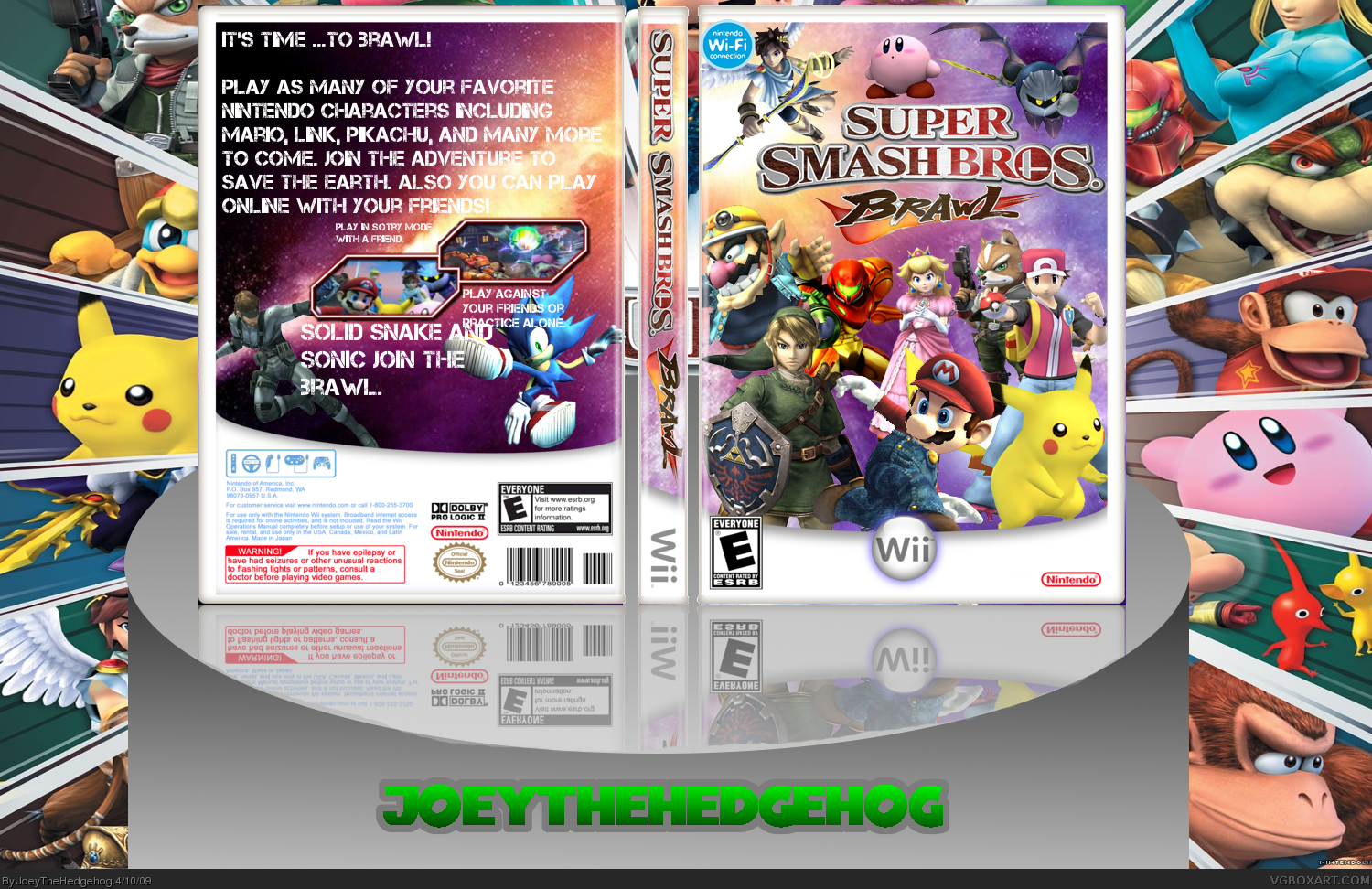
Front is nice. Back is not. The backs screens need to be bigger and text needs to be smaller. Tag line needs to be alot bigger. Try using a diffrent font for the tag line and the regular font. Other than that not to bad
 Super Smash Bros. Brawl Box Cover Comments
This took me sometime too make, and i put a lot of effort into it. hope you like it.
VIEW IN FULL VIEW!
~credit~
Koopadasher-template
Planet renders
Screen borders thread
Edited at 1 decade ago
[ Reply ]
best one yet joey, fav.
[ Reply ]
Thanks rex
[ Reply ]
Not bad!
Edited at 1 decade ago
[ Reply ]
best ever 5/5 cool due
[ Reply ]
Front is nice. Back is not. The backs screens need to be bigger and text needs to be smaller. Tag line needs to be alot bigger. Try using a diffrent font for the tag line and the regular font. Other than that not to bad
[ Reply ]
Your front actually looks pretty nice.
[ Reply ]
the best you have done! fav+
[ Reply ]
I'm making up new words today... first one... Favawesomeness!
[ Reply ]
thanks everyone
[ Reply ]
Updated the box. Fixed up the back.
[ Reply ]
The front is the bestart, the back though could use some work,
[ Reply ]
#12, like what.
[ Reply ]
did anyone notice that the logo is stretched?
[ Reply ]
#14, I'll fix that.
[ Reply ]