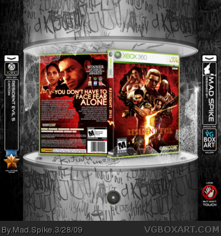
Resident Evil 5
Goal was to create some awsome RE5 box without using the "good old" artworks. And some new material helps me to make it.
There was two versions: red and gray, but I decide to post the red one. Some older concepts of the gray version you can see in the "Poster Album" link
Hope you like it :) Comments and Favs are welcome :)
Yea the front would be better with the whole logo, and as #9 said, the tagline is a bit out. Maybe something like the Kijuju text? idk just a suggestion.
An extremely small thing to note is that the 5 comes off the tagline onto the front. I don't know if that was intentional? Also I think the tagline should be made using the font from the kijuju text. Overall incredible box, glad to have you back ;)
UPDATE: As many asks I replaced "5" logo to "Resident Evil 5" one. I like old version more, but if you ask :) For those who like the old version more - check out Version 1.
But I am not changed the back cover's tagline font. I think it fits good. It more like Resident Evil font, but more bold - perfect for tagline. Also, KIJUJU font can't glow or something (I think) :P
 Resident Evil 5 Box Cover Comments
Resident Evil 5
Goal was to create some awsome RE5 box without using the "good old" artworks. And some new material helps me to make it.
There was two versions: red and gray, but I decide to post the red one. Some older concepts of the gray version you can see in the "Poster Album" link
Hope you like it :) Comments and Favs are welcome :)
[ Reply ]
O.O
[ Reply ]
ZOMG.
[ Reply ]
KRAZY!
[ Reply ]
Uh huh.
[ Reply ]
OMFG! :0
[ Reply ]
Really cool actually, but i would have preferred the whole logo on the front, rather then just a 5. But very awesome otherwise. :D
[ Reply ]
Agreed with #7 but other than that this is superb. Wow, just wow.
[ Reply ]
Wow. The only thing i dont like is the font used for the tagline + fav
[ Reply ]
The front isnt that original but I love the back!
[ Reply ]
I agree with #7.
It's still awesome though +fav
[ Reply ]
O! M! G!!!!!!! AMAZING! 5/5: Awesome! May I please, PLEASE, have those renders? I SWEAR i will give credit! Please?
[ Reply ]
Yea the front would be better with the whole logo, and as #9 said, the tagline is a bit out. Maybe something like the Kijuju text? idk just a suggestion.
Superb box as always though =)
[ Reply ]
Your skills are godly!
[ Reply ]
I think what I'm impressed with the most is the broken glass around the box.
[ Reply ]
Then you should check Burnout box, cos this glass originaly taken from there :)
Good old glass :)
Edited at 1 decade ago
[ Reply ]
An extremely small thing to note is that the 5 comes off the tagline onto the front. I don't know if that was intentional? Also I think the tagline should be made using the font from the kijuju text. Overall incredible box, glad to have you back ;)
[ Reply ]
WOW! Splendid work, Spike. ;)
[ Reply ]
Best RE5 box.
[ Reply ]
Damn, that really puts mine to shame. Fantastic work!
[ Reply ]
UPDATE: As many asks I replaced "5" logo to "Resident Evil 5" one. I like old version more, but if you ask :) For those who like the old version more - check out Version 1.
But I am not changed the back cover's tagline font. I think it fits good. It more like Resident Evil font, but more bold - perfect for tagline. Also, KIJUJU font can't glow or something (I think) :P
Edited at 1 decade ago
[ Reply ]
I just jizzed in my pants!
[ Reply ]
Congrats on hall!
[ Reply ]
nice!!!
[ Reply ]
It's nice, but the back is sort of boring.
[ Reply ]
An absolutely awful box.
[ Reply ]
Those darn taggers! They wrote all over the presentation!
This is boss even with the graffiti though.
[ Reply ]
Awesome design and incredible presentation!
[ Reply ]
Awehum!!
[ Reply ]
Epic, original, resources used brilliantly, well done mate, its a cracker.
[ Reply ]
Get someone a "Kijuju" - Font? I don´t find any thing...pls, help me ^^
[ Reply ]
#31, It's not a font.
[ Reply ]
32#: And how I can make that?
[ Reply ]
Wow, really good! congratz
[ Reply ]