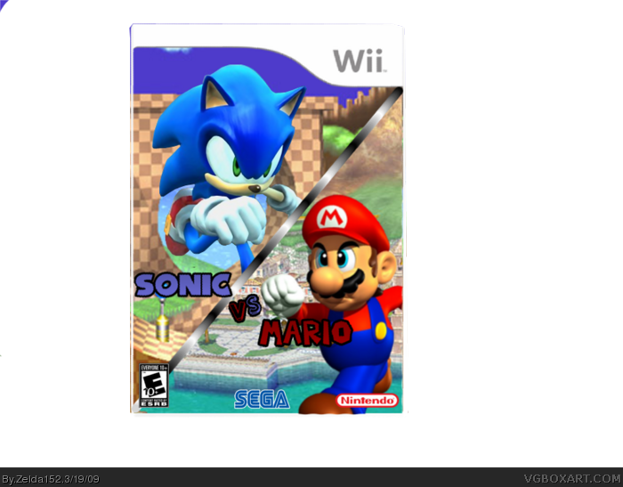
#9, What I mean is this is essentially 10 items,
1:a line going down the middle
2:mario render
3:sonic render
4:logo
5:delfino plaza
6:green hill zone
7:nintendo logo
8:sega logo
9:Esrb
10: Wii template
the logo could be bigger,but its good, the mario is sort of old school and the eyes are bother some....
other than that i have nothing to say
good job.
8/10
 Sonic vs. Mario Box Cover Comments
sorry about the blue in the corner...
Cred: Silent Oblivion for the logo
other than all that what do you think?
[ Reply ]
this isnt bad! :) i would suggest using the mario on mario party ds cover. and maybe trimming the empty space.
Edited at 1 decade ago
[ Reply ]
I think this is one of your better boxes, needs improvement, but good job :)
[ Reply ]
so how can i fix it?
[ Reply ]
#4, For starters, age rating. Then, Sega/Nintendo logo.
[ Reply ]
#4, like #5 said needs a rating and logos, but this is good. I'll fav.
[ Reply ]
Ha mario is cross eyed, ha, any way the box isnt that bad,
[ Reply ]
You have the basics down, esrb, dev logos, etc.
it jsut doesn't feel very thought through.
[ Reply ]
what d you mean?
they are running at each other from dif. scenes.
[ Reply ]
#9, What I mean is this is essentially 10 items,
1:a line going down the middle
2:mario render
3:sonic render
4:logo
5:delfino plaza
6:green hill zone
7:nintendo logo
8:sega logo
9:Esrb
10: Wii template
it needs more... more.. somthing.
[ Reply ]
like what?
[ Reply ]
cool,but that mario part of the case is in need of a more advanced mario and a mario galaxy background
[ Reply ]
#12 WHAT???? Why??
[ Reply ]
yeah
[ Reply ]
it needs a bigger, brighter and more centered logo
and an explosion behind the logo
Edited at 1 decade ago
[ Reply ]
the logo could be bigger,but its good, the mario is sort of old school and the eyes are bother some....
other than that i have nothing to say
good job.
8/10
[ Reply ]