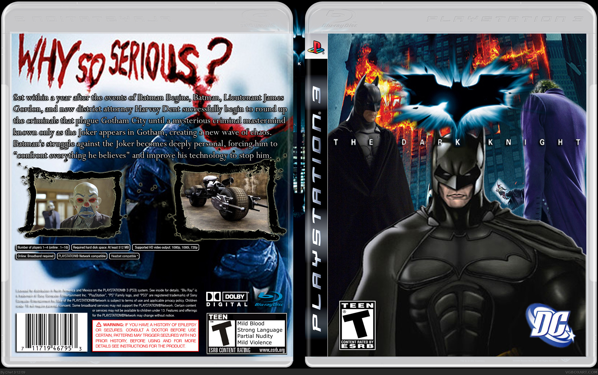
Credit to Sens for Template,
Credit to AllDreamsFallDown for the ESRB on the back,
Credit to PlanetRenders for all of the renders (except for the Joker render on the front, I rendered that and I also rendered the logo. Thanks to shadysaiyan for encouraging me to do that!),
and Credit to Ninty (or Silent Oblivion, I forgot,) for the image borders on the back. Please comment and critic.
I don't like the fact that there are two Batmans on the front. Also, I think that the Batman that's looking directly at you, should ovrlap the symbol. I like the back a lot though.
8/10
#2, thanks for the advice, but when you say 'overlap the symbol', do you mean only the Batman symbol or the Batman symbol and the words? If I overlapped the words, it wouldn't look so good.
 The Dark Knight Box Cover Comments
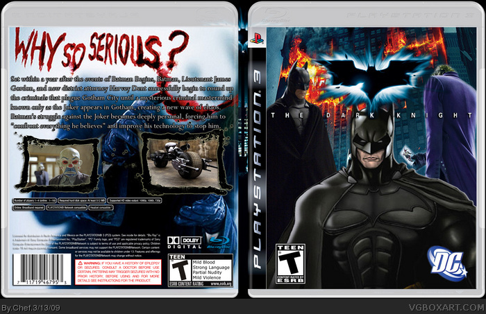
My second box on this account.
Credit to Sens for Template,
Credit to AllDreamsFallDown for the ESRB on the back,
Credit to PlanetRenders for all of the renders (except for the Joker render on the front, I rendered that and I also rendered the logo. Thanks to shadysaiyan for encouraging me to do that!),
and Credit to Ninty (or Silent Oblivion, I forgot,) for the image borders on the back. Please comment and critic.
Edited at 1 decade ago
[ Reply ]
I don't like the fact that there are two Batmans on the front. Also, I think that the Batman that's looking directly at you, should ovrlap the symbol. I like the back a lot though.
8/10
[ Reply ]
#2, thanks for the advice, but when you say 'overlap the symbol', do you mean only the Batman symbol or the Batman symbol and the words? If I overlapped the words, it wouldn't look so good.
[ Reply ]
Oops, double post.
Edited at 1 decade ago
[ Reply ]
It all looks really good, except for the Batman double on the front.
4/5, fav'd
[ Reply ]
#5, thanks.
I'll try to update soon.
[ Reply ]
Sorry for double posting, but thosr screenshot borders are really Qwerty334. Sorry for the misunderstanding.
[ Reply ]
the batman i the front dose not mach the rest of the case it's cool but dose not mach and the back is to plan it needs something
[ Reply ]