[ Box updated on March 6th, 2009 ] [ original ]
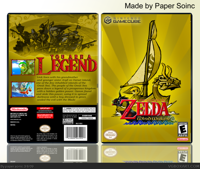
 The Legend of Zelda: The Wind Waker Box Cover Comments
Comment on paper sonic's The Legend of Zelda: The Wind Waker Box Art / Cover.
[ Box updated on March 6th, 2009 ] [ original ]
Comment on paper sonic's The Legend of Zelda: The Wind Waker Box Art / Cover.
yeah im ill :( so....I made that YAY cred to all dreams fall down WICH I EDITED and SO logos for the tagline
Enjoy
PS
Edited at 1 decade ago
[ Reply ]
I like box, but:
The letters of the title have a little blue border, why,and what is ADFD? Anyway great box, 8.5/10 +fav ;)
[ Reply ]
#2, thanks anymore?
Edited at 1 decade ago
[ Reply ]
#3 Maybe you shouldnt use Arial at the back.
Use something more epic for Zelda z.b. Old Book or something.
[ Reply ]
#4, hmm OK good idea
[ Reply ]
updated!!!!!!!!!!!
[ Reply ]
Better, but i still dont get why there is a blue border around the title.
[ Reply ]
#7, what there is none
[ Reply ]
This does look pretty good, and I can see major improvement from you with this design. There are some slight blue pixels around the logo as #7 says when you take a look at the box on full view. Probably something you missed when you rendered the logo. If you can fix that, I can easily see myself faving this one of yours. good job so far. :)
[ Reply ]
#9, updated
[ Reply ]
Cool!
[ Reply ]
#11, Thanks
[ Reply ]
This is very good, but I think the red tagline text would look much better burgundy, or Maroon. Not so red, but a little darker.
The description is also very vague too, and it's missing a "..." at the end. Like Nothing said the logo has a blue border, but it really doesn't take away if you aren't viewing in full.
I'd say this is one of your best. Keep it up!
[ Reply ]
#8, i commented version 2, not 3.
[ Reply ]
#8, i commented version 2, not 3.
[ Reply ]
Great! Your best yet!
[ Reply ]
#16, Thanks man thanks for the tag
[ Reply ]
having got this game its back cover is very good despite what most people say. the front cover is very original. awesome work 10/10 i would fav but i don't know how lol... hope u get betta soon!
[ Reply ]
#18, >___< lol there is a Add to fav buttion at the top
[ Reply ]
I actually like this :) well done
[ Reply ]
This is cool in normal view (Thumbnail or whatever) but in full view,Its pretty blurry. Maybe fix the quality and I'll fave.
:)
[ Reply ]
Agreed with #21, it's blurry, but I love it, so I'll fav anyways. :)
[ Reply ]
updated less blurry i think
[ Reply ]
good.
[ Reply ]
#19 my bad +fav
[ Reply ]
#25, LOL thanks
[ Reply ]
Can I have the template?
[ Reply ]
Wow... O_O It's so beautiful, great job !
[ Reply ]
#28, cheers
[ Reply ]