Very nice looking, and great composition. I might try to make the logo on the front stand out a bit more though. Still, easily worth my fav. Great job.
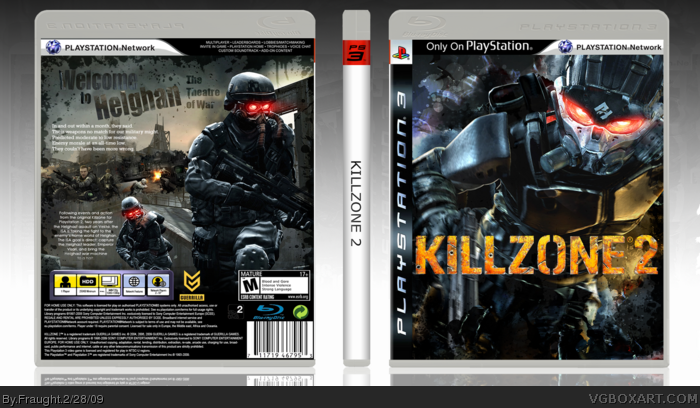
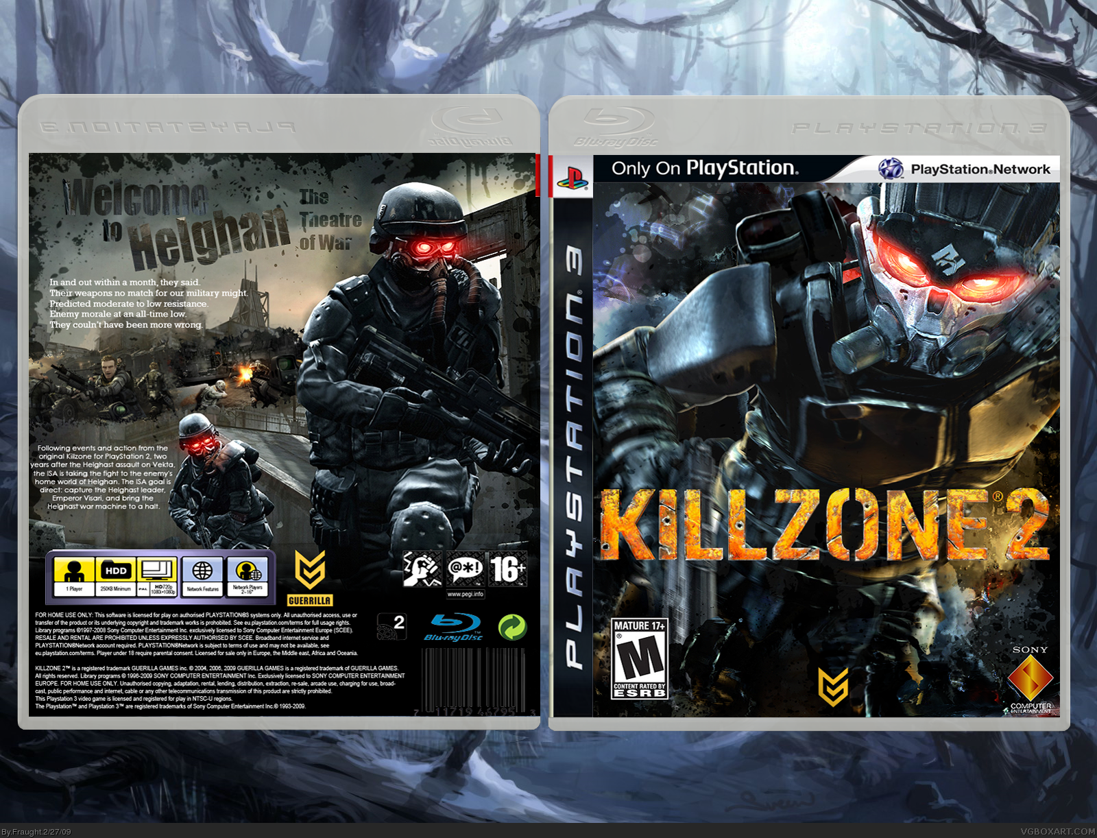
#4, #10, you are right, this is excellent stuff, but I think that might be going a little far. It's your opinions, that's cool, but that's a little much. I notice a few little mistakes here and there. For one, the barcode on the back should have a white box around it, and the heading on the back looks kinda generic and out of place for killzone. That font is Impact, right? plus, having the word "Helghan" titled on it's side looks a little weird.
#15, Sheesh. I guess you can't satisfy everyone. Anyway, I did the back of the barcode white. And also, liking is subjective. I, for one, liked the Helghan that was tilted abit.
Also, it's my 5th box ever, you could go abit softer on me. :D
 Killzone 2 Box Cover Comments
So, since I am going to buy a PS3 with Killzone 2 soon, I thought I'd make a box with it.
Anyway, this is one of my 'longest-in-the-making' boxes, and I really hope people'll like it.
Also, I'd like constructive criticism, I can improve the box then.
Edited at 1 decade ago
[ Reply ]
This looks great! Looks very authentic. The only aspect I don't like is the explosion in between the E and the 2 on the front.
9/10
[ Reply ]
#2, Thanks. I really appreciate that you like it. :)
It isn't an explosion, it's a smudged spot. I don't think I could fix it, without the result being ugly.
[ Reply ]
In my opinion this is the greatest Killzone 2 box on the site.
Kudos.
[ Reply ]
#4, Thanks PuzzleMan. ;)
Anyway, thanks to everyone who fav'd, I've never gotten favs so fast, or so much, for that matter.
[ Reply ]
#3, don't change it then, it isn't worth it.
[ Reply ]
the only thing i don't like is that you haven't got a rating on the back but other than that its really good why don't you comment on some of my work
[ Reply ]
Nice! I'd personally play around with the paragraph text a bit more though. Great job and I'll be picking this game up too. ;)
[ Reply ]
#7, but it has the little 16+ there, doesn't it? Okay, the front and back's ratings differ, but I'll fix that later.
#8, paragraph text? With which, the upper text, or the one next to the lower Helghast there? Anyway, thanks for fav. ;)
[ Reply ]
This is definitly the best killzone 2 box and it deserves hof, but change the back from "pegi" to "esrb"
[ Reply ]
Very nice looking, and great composition. I might try to make the logo on the front stand out a bit more though. Still, easily worth my fav. Great job.
[ Reply ]
#10, Thank you, thank you. :)
#11, Thanks alot. :)
Anyway, an update again. I added the ESRB logo on the back, instead of the PEGI one I had before.
[ Reply ]
#8, Agreed looking nice though =D
[ Reply ]
#13, Dude, which one? I have two places where there is text. :D Thanks too. :)
[ Reply ]
#4, #10, you are right, this is excellent stuff, but I think that might be going a little far. It's your opinions, that's cool, but that's a little much. I notice a few little mistakes here and there. For one, the barcode on the back should have a white box around it, and the heading on the back looks kinda generic and out of place for killzone. That font is Impact, right? plus, having the word "Helghan" titled on it's side looks a little weird.
[ Reply ]
#15, Sheesh. I guess you can't satisfy everyone. Anyway, I did the back of the barcode white. And also, liking is subjective. I, for one, liked the Helghan that was tilted abit.
Also, it's my 5th box ever, you could go abit softer on me. :D
[ Reply ]
Yes, very nice, playstation network bar is missing on the back though.
[ Reply ]
Wow major improvement from your other boxes
[ Reply ]
Great job dude ^_^
+fav
[ Reply ]
#18, Yeah. I actually do other graphics, and my last box was like 5 months ago, and I like making video game boxes, so I thought: "Why not?"
Thanks alot. ;)
[ Reply ]
Very Nice
[ Reply ]
#21, Thanks.
I accidentally put the picture with the PEGI ratings on it, so I had to update and put the one with the ESRB etc. Things got a little messy.
[ Reply ]
I added the side. Also,
#17, I added the Playstation bar on the back. ;) Hope you like it more now.
#19, Thank, DeathSpawn. :)
[ Reply ]