This is outstanding. Very, very good, and a change from the regular RE boxes posted.
However, I don't think you captured the action/horror feel of the game, personally, I would get the feeling that this is a hunting game were it absent of an appropriate logo. Perhaps a render of one of the African Infected lurking in the grassland in the distance? Or something innovative, like an infected Lion?
I think the concept is flawless, and with countless possibilities, but the execution doesn't flatter that statement. For what you have done with it though, I must say, very, very well done.
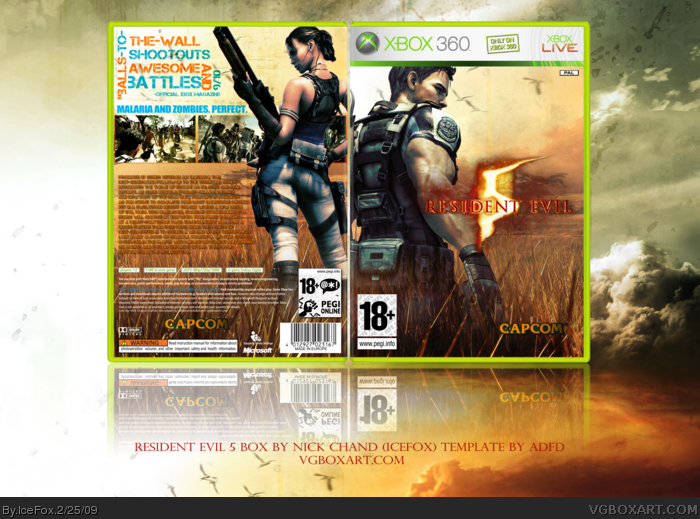
7 - thank you. The idea with the front was to sort of capture the isolation. You and your partner are alone. No one else but you and the waves of infected men and woman coming towards you. I wanted to capture isolation with the front. But you're right...something in the distance would have been good.
Box looks cool. Has a unique feel to it compared to other RE5 boxes. Though I guess I'd be using the word "unique" very loosely here, considering that save for the renders, logo, and the screens...I almost thought it was a FarCry 2 box, lol.
I like the way you set up the tagline text, but not the actual font and colors you used. (Orange works, but blue? not so much) A bit too much synopsis text too.
Nice work! Yea, the bg should be little darker, and i love that CAPCOM logo, i just dont like the colored text on the back. Takes the feel away from it. 4.75/5: Great!
 Resident Evil 5 Box Cover Comments
I should probably make the BG darker.
Full view please.
[ Reply ]
OH MY GAWD.
[ Reply ]
Wow!!!!!!!!!!!!! great job man! u rock! 10 out of 10.
[ Reply ]
I see the beef.
[ Reply ]
I just don't like this box. Sorry
[ Reply ]
#5, ??? huh i could u say that this box rocks!
[ Reply ]
This is outstanding. Very, very good, and a change from the regular RE boxes posted.
However, I don't think you captured the action/horror feel of the game, personally, I would get the feeling that this is a hunting game were it absent of an appropriate logo. Perhaps a render of one of the African Infected lurking in the grassland in the distance? Or something innovative, like an infected Lion?
I think the concept is flawless, and with countless possibilities, but the execution doesn't flatter that statement. For what you have done with it though, I must say, very, very well done.
[ Reply ]
7 - thank you. The idea with the front was to sort of capture the isolation. You and your partner are alone. No one else but you and the waves of infected men and woman coming towards you. I wanted to capture isolation with the front. But you're right...something in the distance would have been good.
[ Reply ]
I love how different this is. But i hate the back font you used so much that it keeps me from faving
[ Reply ]
"Malaria and Zombies. Perfect" = WIN.
I really like the alternative style you did this in. The characters amidst the fields invokes a great atmosphere of tension in the design.
[ Reply ]
I really hate the back to be honest. Also the front needs more terror or something.
[ Reply ]
#5, Not very helpful.
Box looks cool. Has a unique feel to it compared to other RE5 boxes. Though I guess I'd be using the word "unique" very loosely here, considering that save for the renders, logo, and the screens...I almost thought it was a FarCry 2 box, lol.
I like the way you set up the tagline text, but not the actual font and colors you used. (Orange works, but blue? not so much) A bit too much synopsis text too.
[ Reply ]
Nice work! Yea, the bg should be little darker, and i love that CAPCOM logo, i just dont like the colored text on the back. Takes the feel away from it. 4.75/5: Great!
[ Reply ]
Looks Alright,
-i don't like he typography on the back and the color choice for it doesn't fit the rest of the box
-The characters should look like they are either in front of the grass or in the grass, making them blend into it looks bad and doesn't make sense.
-This game is not exclusive.
-Dark gradient on the Capcom logo is distracting
Like LK, it was instantly obvious (though it doesn't matter) that the background is from FC2 art.
[ Reply ]
Love it. I would just change the tagline colors.
[ Reply ]
It's different.
In a goood way.
Faved
[ Reply ]
Dude, your best yet, just AWESOME!!!
8.7/10 +fav
Oh, and could you upload a printable version please? :)
Edited at 1 decade ago
[ Reply ]
This is a really nice box. BUT the background isn't working for me as it's from far cry 2 and also the tagline on the back doesn't have a horror feel.
[ Reply ]
The one thing I don't like is the style of the text on the back (the big text above). 4/5
[ Reply ]
The logo on the front is too stretched and personally not big enough however I do love the box so fave for that.
[ Reply ]
I really like this, and I don't agree with others that the font type on the back doesn't look good. Awesome job! =)
[ Reply ]
Congrats on the HoF!
[ Reply ]