I like the front, but not the back. The background is a tad boring. Eggman has no legs, there's a blank screen border, and the text is unattractive. 2.7/5
It looks really nice. Well, at least the front does. On the back, the font you used is a bit generic and the background on both the front and back is plain.
7/10
It looks really nice. Well, at least the front does. On the back, the font you used is a bit generic and the background on both the front and back is plain.
7/10
 Sega Superstars Tennis Box Cover Comments
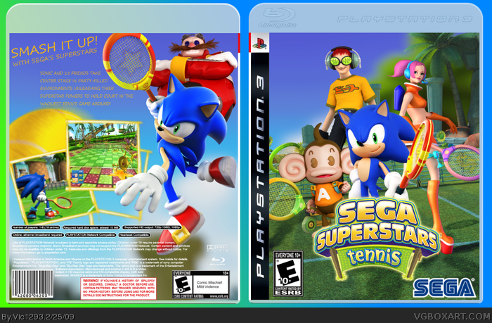
My first "happy go lucky" box. Screen borders from rasengan_boi. ESRB and DEV logos by ADFD. Hope you like it!
[ Reply ]
Not bad.
[ Reply ]
I like the front, but not the back. The background is a tad boring. Eggman has no legs, there's a blank screen border, and the text is unattractive. 2.7/5
Edited at 1 decade ago
[ Reply ]
FINALLY NOT A RESIDENT EVIL BOX!
[ Reply ]
#4, I KNOW! lol.
#3, Thanks. I may upgrade soon.
[ Reply ]
The front's not bad, but the back is too plain for my tastes...
[ Reply ]
#6, K! I'll upgrade soon. Thanks
[ Reply ]
Nice, a bit blurry. 8.2/10 +fav
[ Reply ]
It looks really nice. Well, at least the front does. On the back, the font you used is a bit generic and the background on both the front and back is plain.
7/10
[ Reply ]
It looks really nice. Well, at least the front does. On the back, the font you used is a bit generic and the background on both the front and back is plain.
7/10
[ Reply ]
#10, I had no better font, no double posting please, and the background is supposed to be plain. Thanks for viewing.
#8, Thanks!
[ Reply ]
nice
[ Reply ]
#12, Thanks
[ Reply ]
It is nice, but the back is a little bland and try to spice up the front a bit, but faved for the effort
[ Reply ]