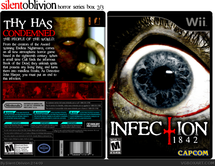
[ Buy Infection: 1842 at Amazon ] » 2009 Hall of Fame Winner! By Silent Oblivion 45 on February 14th, 2009 No Printable Available [ Box updated on February 14th, 2009 ] [ original ] Infection: 1842 Box Cover Comments Comment on Silent Oblivion's Infection: 1842 Box Art / Cover. Cancel Reply Silent Oblivion 45 [ 1 decade ago ] My latest! I think its my best so far, it took more than 6 hours, then I had to re-do as my PC crashed, and corrupted the files. Its my second 'Horror' themed box, continuing from my Endless Nightmares one. Tons of work went into this. Comment! :P Edited at 1 decade ago [ Reply ] afifan000 44 [ 1 decade ago ] It definitely is your best box by far, and it looks very stylish as well. [ Reply ] roza 44 [ 1 decade ago ] nice, i was actually going to do somthing like this but now I may not bother, wouldnt stand up to this! [ Reply ] axel_master 29 [ 1 decade ago ] very nice box man! [ Reply ] Silent Oblivion 45 [ 1 decade ago ] @3 - Bet it could! Thanks for the comments and favs guys! [ Reply ] Drakxxx 46 [ 1 decade ago ] Awesome job man! It really reminds me of the PC game boxes from the late 80's early 90's. Very cool. [ Reply ] paper sonic 37 [ 1 decade ago ] nice [ Reply ] Spiderpig24 48 [ 1 decade ago ] Amazing job! +fav [ Reply ] Ray Blade 40 [ 1 decade ago ] It's very inventive, but I'm not so sure I like the screencaps. Everything else is satisfactory though. Overall nice job! [ Reply ] Silent Oblivion 45 [ 1 decade ago ] Thanks for the comments and favs guys! [ Reply ] ClonedX 35 [ 1 decade ago ] that's amazing dude. Your best so far :) [ Reply ] gamerking 43 [ 1 decade ago ] that's awesome! :D [ Reply ] Vic1293 31 [ 1 decade ago ] Two words, AWE and SOME!!! [ Reply ] billyman31 40 [ 1 decade ago ] #11, agreed. [ Reply ] Brettska 32 [ 1 decade ago ] Very cool, but if you could make the blue info on the back template red, thatd be even cooler [ Reply ] Silent Oblivion 45 [ 1 decade ago ] I'll sort that in a update, again guys, thanks for the comments and favs. [ Reply ] Blur 1 [ 1 decade ago ] Creepy in many ways, Makes me want to watch Horror Movies anyways Well Done with this box, I get the dark, bloody feel to It. + Fav. [ Reply ] super-mega-hyper-sonic 41 [ 1 decade ago ] one thing i don't like. The inverted temp. [ Reply ] Silent Oblivion 45 [ 1 decade ago ] Its actually semi-inverted. :P And the white temp just ruins the colour scheme Edited at 1 decade ago [ Reply ] Legend_Chronicles2 37 [ 1 decade ago ] Very nice layout. Well done. [ Reply ] AnthonyTheHedgehog 1 [ 1 decade ago ] cool [ Reply ] Poop Dawg 3 [ 1 decade ago ] Pretty good [ Reply ] Whoomp 43 [ 1 decade ago ] I like the front very much but I'm not really a fan of the blue/red-combination of the back. Fav'ed none-the-less. [ Reply ] a-beast-of-art 39 [ 1 decade ago ] I don't like how the screens are red, and I dont like the inverted temp, but it is pretty nice over all. The front looks alot like manhunt 2, though. [ Reply ] Haruhism 7 [ 1 decade ago ] Best I think here have a great big fav sticker from me [ Reply ] Rex_the_dinosoar 34 [ 1 decade ago ] nice box, dont like black temp though. 4/5. [ Reply ] Silent Oblivion 45 [ 1 decade ago ] Thanks for the comments and favs guys. Like I said before, the box looks horrible with the normal temp, I used this one for a reason :P [ Reply ] Scorpion Soldier 45 [ 1 decade ago ] Awesome design, front reminds me a lot of Manhunt 2, but with a twist in the design, great job. +fav [ Reply ] yummybrains 30 [ 1 decade ago ] I fucking love it. Sweet design. [ Reply ] Weezer 9 [ 1 decade ago ] Awesome job on this. fav+ [ Reply ] Gradon 18 [ 1 decade ago ] Holy Crap. So freaky, disturbing, awesome. Except the RE4 screenshots, but the red tint totally adds atmospheric scares. +Fav for you. :P [ Reply ] Rossagues 42 [ 1 decade ago ] I really hate the inverted template.. im sorry [ Reply ] numerobetically 42 [ 1 decade ago ] Either the template's blurry or my eyesight isn't as good as it was five minutes ago. [ Reply ] Silent Oblivion 45 [ 1 decade ago ] Thanks for the Hall guys! [ Reply ] redstar1993 10 [ 1 decade ago ] Nice work, not into the black temp much but fav'd anyway [ Reply ]
 Infection: 1842 Box Cover Comments
My latest! I think its my best so far, it took more than 6 hours, then I had to re-do as my PC crashed, and corrupted the files. Its my second 'Horror' themed box, continuing from my Endless Nightmares one. Tons of work went into this.
Comment! :P
Edited at 1 decade ago
[ Reply ]
It definitely is your best box by far, and it looks very stylish as well.
[ Reply ]
nice, i was actually going to do somthing like this but now I may not bother, wouldnt stand up to this!
[ Reply ]
very nice box man!
[ Reply ]
@3 - Bet it could!
Thanks for the comments and favs guys!
[ Reply ]
Awesome job man! It really reminds me of the PC game boxes from the late 80's early 90's. Very cool.
[ Reply ]
nice
[ Reply ]
Amazing job! +fav
[ Reply ]
It's very inventive, but I'm not so sure I like the screencaps. Everything else is satisfactory though. Overall nice job!
[ Reply ]
Thanks for the comments and favs guys!
[ Reply ]
that's amazing dude.
Your best so far :)
[ Reply ]
that's awesome! :D
[ Reply ]
Two words, AWE and SOME!!!
[ Reply ]
#11, agreed.
[ Reply ]
Very cool, but if you could make the blue info on the back template red, thatd be even cooler
[ Reply ]
I'll sort that in a update, again guys, thanks for the comments and favs.
[ Reply ]
Creepy in many ways, Makes me want to watch Horror Movies anyways Well Done with this box, I get the dark, bloody feel to It. + Fav.
[ Reply ]
one thing i don't like.
The inverted temp.
[ Reply ]
Its actually semi-inverted. :P
And the white temp just ruins the colour scheme
Edited at 1 decade ago
[ Reply ]
Very nice layout. Well done.
[ Reply ]
cool
[ Reply ]
Pretty good
[ Reply ]
I like the front very much but I'm not really a fan of the blue/red-combination of the back. Fav'ed none-the-less.
[ Reply ]
I don't like how the screens are red, and I dont like the inverted temp, but it is pretty nice over all. The front looks alot like manhunt 2, though.
[ Reply ]
Best I think here have a great big fav sticker from me
[ Reply ]
nice box, dont like black temp though. 4/5.
[ Reply ]
Thanks for the comments and favs guys.
Like I said before, the box looks horrible with the normal temp, I used this one for a reason :P
[ Reply ]
Awesome design, front reminds me a lot of Manhunt 2, but with a twist in the design, great job. +fav
[ Reply ]
I fucking love it. Sweet design.
[ Reply ]
Awesome job on this. fav+
[ Reply ]
Holy Crap. So freaky, disturbing, awesome.
Except the RE4 screenshots, but the red tint totally adds atmospheric scares.
+Fav for you. :P
[ Reply ]
I really hate the inverted template.. im sorry
[ Reply ]
Either the template's blurry or my eyesight isn't as good as it was five minutes ago.
[ Reply ]
Thanks for the Hall guys!
[ Reply ]
Nice work, not into the black temp much but fav'd anyway
[ Reply ]