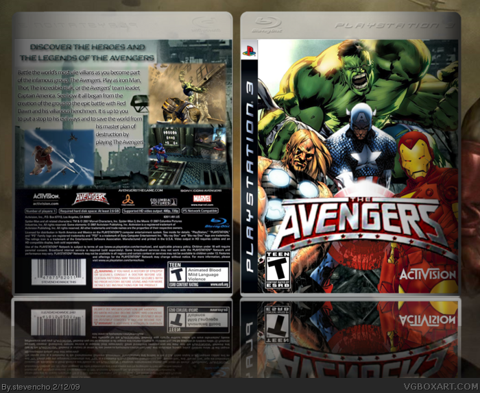
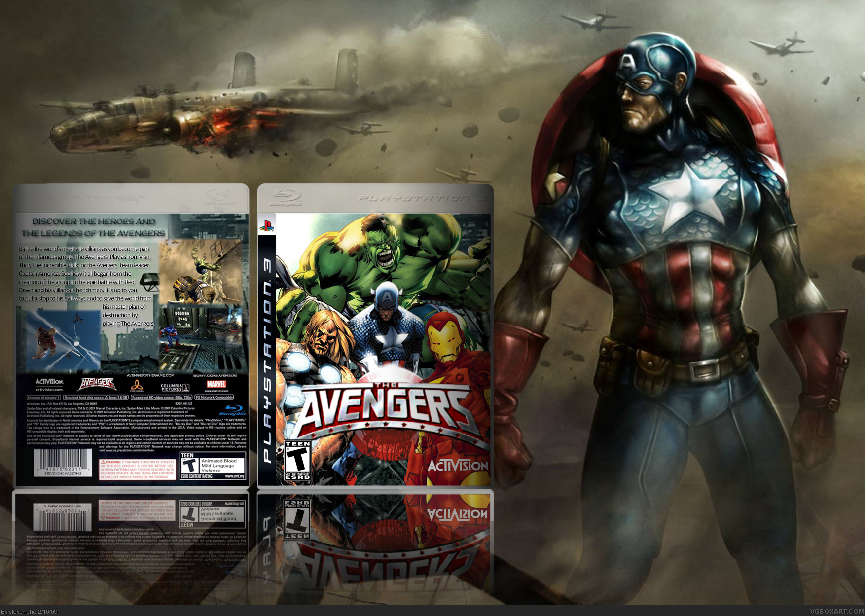
This is probably my most complicated box to date. Each character on the front was individually rendered and so was the logo. The esrb and activision logos were then added in. The back consists of separate screenshots and my own font. The reflection and shadowing were also all by myself.
 The Avengers Box Cover Comments
This is probably my most complicated box to date. Each character on the front was individually rendered and so was the logo. The esrb and activision logos were then added in. The back consists of separate screenshots and my own font. The reflection and shadowing were also all by myself.
Thanks for viewing! Open for suggestions.
Edited at 1 decade ago
[ Reply ]
Unnecessary Presentation is Unnecessary
[ Reply ]
the front looks wicked!
[ Reply ]
You should put some borders on the screens and make them a little smaller.. but the front looks great!
[ Reply ]
Not bad, the logo on the front is slightly low in quality and the back needs work. Needs better text usage, and screenborders.
[ Reply ]
Yeah the back is not really doing it for me. If anyone knows a link to a tutorial for making good fonts that would be great.
[ Reply ]
This Is Good
Hall Of Fame Contender
Fav
[ Reply ]
If you thinks it deserves fav you have to press the favorite button.
[ Reply ]
I love the activision logo!
[ Reply ]