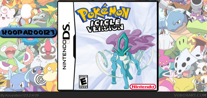
Enjoy my new box!
Credit:
Logo: Silent Oblivion
Render: Geno
Hope you like it! Also, I'm pretty sick and have to stay home. :(, I've got alot of laptop and rest time...
Your other boxes where way more interesting but you ARE good so I'll add you too my FAV authors so I can keep an eye on your masterpieces!
This one's good too tough!
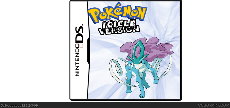
Guys, it's supposed to be plain. Look at the offical, just a pokemon and a background witha logo. AND WORK ON THE SPELLING, PAPER SONIC!! Also, all of my boxes have a Silent Oblivion logo.
This box is O.k.. BUT BLAND. Look at a real Pokemon Box. No Nintendo, or Pokemon Company Logo? The Pokemon logo has been recoloured (Looks like the RuSa Title screen). The Icicle version emblem is not like the official.
The render is O.K, but not as good as Ken Sugamori. I give this a 3/5
 Pokemon: Icicle Version Box Cover Comments
Enjoy my new box!
Credit:
Logo: Silent Oblivion
Render: Geno
Hope you like it! Also, I'm pretty sick and have to stay home. :(, I've got alot of laptop and rest time...
Edited at 1 decade ago
[ Reply ]
wow that's the first logo by Silent Oblivion i don't like but your getting better but move the logo a bit righter
P.S hope you get better soon :)
#5.yes sir edit it sir :P
Edited at 1 decade ago
[ Reply ]
I agree with 2#
[ Reply ]
Your other boxes where way more interesting but you ARE good so I'll add you too my FAV authors so I can keep an eye on your masterpieces!
This one's good too tough!
Edited at 1 decade ago
[ Reply ]
Guys, it's supposed to be plain. Look at the offical, just a pokemon and a background witha logo. AND WORK ON THE SPELLING, PAPER SONIC!! Also, all of my boxes have a Silent Oblivion logo.
[ Reply ]
UPDATED
[ Reply ]
Wow, that Pokémon is rendered baad...
[ Reply ]
#7,Not my fault. *Points at Geno*
[ Reply ]
oops, my mistake. it was actually rendered by LENNY! *Slaps self in face*
[ Reply ]
better now
[ Reply ]
Too much space on the sides.
[ Reply ]
well I did render it but not that bad. Your resizing messed it up. Anyway the box isn't real good along with the logo.
Edit: I edited your thread to a maybe better render with a smaller size also thats not an ice pokemon.
Edited at 1 decade ago
[ Reply ]
UPDATE!
It know has a clearer render and a background and a logo I made myself.
[ Reply ]
You should of joined the Pokemon Comp!!!
[ Reply ]
(Post Deleted By User For It's Stupidness)
Edited at 1 decade ago
[ Reply ]
This box is O.k.. BUT BLAND. Look at a real Pokemon Box. No Nintendo, or Pokemon Company Logo? The Pokemon logo has been recoloured (Looks like the RuSa Title screen). The Icicle version emblem is not like the official.
The render is O.K, but not as good as Ken Sugamori. I give this a 3/5
[ Reply ]
DANG! I forgot the developer logos. My bad.
[ Reply ]
The new version is better! The quality is better, I have no comments.
[ Reply ]