Nice Joe, one of your bests in my opinion. I don't know how the 3D would work on dvd, but it's cool none the less. I really like the front, and you've REALLY improved on your back designs.
plus there wasn't much to work with so sorry if it's not scary enough. lol.
and thanks dersnap...i think that's the first somewhat nice comment you've ever given me. =P plus, i work in gimp so yeah...they're always a tad blurry. :P
good job joe...*looks at front and tears fall down face* =D...*looks at back* oh... lol...here's tips to do with the back...
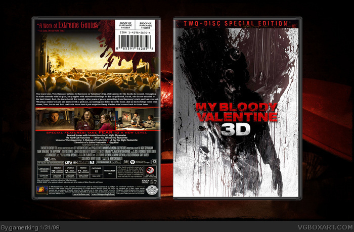
1. i think the whole fire coming through the screen pic should be trashed and as many have already said...pick something "scary"
2. text on back should be higher like over where the pic of the audience is and a lot bigger
3. u should find a better blood splatter that one looks cheesy =/
4. pick scarier pics 4 the screen shots...cause they r too bright for the cover and also there's like one with kids watching tv...wtf? O.o
5. i'm an idiot...those are cops...and that's the only pic that's a bit too bright sorry =P
6. the screenshots look kind of squashed too...that's all...no more! xP
#21, he used that pic, but edited it. Sure, they look the same, and I understand why you would assume, but he did not just copy and paste the image. work was done on it.
Anyways GK, I have to say, I'm really impressed by this, awesome work. However, the back info is from The Happening, and you should probably work more on your fonts, because it seems that you use the same one over and over again. All that aside, nice work, and a pretty nice concept too ;)
who cares what comment he uses? i don't understand why people get so offended if u take a comment from sweeney todd for example and use it on a box...it doesn't really matter in my thought. =P
#10, 3D Glasses, EXACTLY what I was thinking. I'm actually liking this a lot. The back doesn't feel much like a horror movie, but it totally reminds me of the commercials. Good call.
If the movie hasn't come out on dvd yet, a suggestion for you to get the right credit info is to look up the movie's posters. They usually design one that has the credit info you can grab.
it looks good but the blood on the back you can see some white where it didn't erase if you where you using the magic eraser or from where ever you got it
oh and i see you used the credits and stuff from the happening...im dumb and usally type the dang things out lol
 My Bloody Valentine 3D Box Cover Comments
Whoot! :D
[ Reply ]
First fav! The original was much better than this. I mean the killer was a psychotic cannibal in the original. They took the balls off this movie.
Edited at 1 decade ago
[ Reply ]
Yes....mighty awesome!
[ Reply ]
awsome box! fav.
[ Reply ]
Awesome! +fave
[ Reply ]
thanks guys! =D
[ Reply ]
Love the front, not so much the back. It just... doesn't give you that horror feel.
[ Reply ]
Your boxes aren't bad, but they're always horribly blurry. You should try using better quality art.
Edited at 1 decade ago
[ Reply ]
Nice Joe, one of your bests in my opinion. I don't know how the 3D would work on dvd, but it's cool none the less. I really like the front, and you've REALLY improved on your back designs.
[ Reply ]
Should have added some 3d glasses. :P
[ Reply ]
Don't really care for the back, not scarry enough, and isn't the front just a wallpaper?
[ Reply ]
Dude, that bar code is the same one you used for your 300 box, lol. Still love it though. +fav
[ Reply ]
I just noticed that the special features are the same as your The Happening box.
[ Reply ]
wow. alot of favs while i was gone. =P
plus there wasn't much to work with so sorry if it's not scary enough. lol.
and thanks dersnap...i think that's the first somewhat nice comment you've ever given me. =P plus, i work in gimp so yeah...they're always a tad blurry. :P
Edited at 1 decade ago
[ Reply ]
good job 5 out of 5
[ Reply ]
And to think i used to hate you as much as DK27, you have improved 10 fold, this looks fantastic!
[ Reply ]
....you hated me?...
[ Reply ]
good job joe...*looks at front and tears fall down face* =D...*looks at back* oh... lol...here's tips to do with the back...
1. i think the whole fire coming through the screen pic should be trashed and as many have already said...pick something "scary"
2. text on back should be higher like over where the pic of the audience is and a lot bigger
3. u should find a better blood splatter that one looks cheesy =/
4. pick scarier pics 4 the screen shots...cause they r too bright for the cover and also there's like one with kids watching tv...wtf? O.o
5. i'm an idiot...those are cops...and that's the only pic that's a bit too bright sorry =P
6. the screenshots look kind of squashed too...that's all...no more! xP
Edited at 1 decade ago
[ Reply ]
This is pretty good, but the backs on all your DVDs seem too similar.
[ Reply ]
Nice :)
[ Reply ]
Hold the phone, look at link .
Edited at 1 decade ago
[ Reply ]
never said i made the pic mate. but look at both of them. mine IS different. i played with the colors and stuff in gimp. you're allowed to do that.
[ Reply ]
#21, he used that pic, but edited it. Sure, they look the same, and I understand why you would assume, but he did not just copy and paste the image. work was done on it.
[ Reply ]
Looks pretty good:D I want to see you do a halloween box(the 2007 remake):D
[ Reply ]
Another Sweeney Todd quote? Come on! And where did you cut the legal info from? M. Night Shyamalan?
EDIT: It says M. Night Shyamalan on your Friday the 13th box too. : <
Edited at 1 decade ago
[ Reply ]
what's wrong with Sweeney quotes? lol. they always seem to fit the tones of my boxes. xD
[ Reply ]
Yeah, what IS wrong with Sweeny qoutes. Also this is really close to the HOF!
[ Reply ]
not sure, george. o.O
lol. and thanks for the fav yoshistar! :D
[ Reply ]
#21, You've used wallpapers before too...
Anyways GK, I have to say, I'm really impressed by this, awesome work. However, the back info is from The Happening, and you should probably work more on your fonts, because it seems that you use the same one over and over again. All that aside, nice work, and a pretty nice concept too ;)
[ Reply ]
who cares what comment he uses? i don't understand why people get so offended if u take a comment from sweeney todd for example and use it on a box...it doesn't really matter in my thought. =P
[ Reply ]
wow...thanks karma! :D
this box is revolutionary! lol. shadysaiyan no longer hates me, and karma and dersnap actually gave me good comments! =D
and lol, ryan. =P
[ Reply ]
#31, Lol that's surprising to know. :P
[ Reply ]
This is one of my favorite boxes from you, should be in the HoF.
BTW, I like your new avatar.
[ Reply ]
thanks spiderpig! 128 points in case you were wondering. :D
and yeah, i love my new avatar too. =P
[ Reply ]
+fav, seems that you've seen "Shaun of the Dead" recently, great movie
[ Reply ]
C'mon, HoF.
[ Reply ]
actually i saw shaun of the dead a long while ago but i just bought that and Hot Fuzz on dvd so i'm kinda obsessed. o.O
and thanks #36. 142 points. :/
[ Reply ]
#37, I should be asking for a HoF...
also, don't have either, but they were funny as hell :P
[ Reply ]
yes...yes they were. :D
[ Reply ]
How'd I miss this? The front is just fantastic! Do you ever cease to amaze gamerking?
[ Reply ]
#10, 3D Glasses, EXACTLY what I was thinking. I'm actually liking this a lot. The back doesn't feel much like a horror movie, but it totally reminds me of the commercials. Good call.
If the movie hasn't come out on dvd yet, a suggestion for you to get the right credit info is to look up the movie's posters. They usually design one that has the credit info you can grab.
[ Reply ]
I would say this should get hall but that would be a lie lol
[ Reply ]
Yay! Hall of Fame. It only took until 150+ points. Congratulations gamerking!
[ Reply ]
Congrats G@m3r k!ng
[ Reply ]
WHOOT! lol. thanks to all 32 who faved and anyone who gave comments. i really appreciate it. :D
[ Reply ]
Congrats on the HoF Gamerking.
[ Reply ]
No fair, I want a HoF lol Congrats man. This is amazing.
[ Reply ]
Woah, you got better since I was gone... +Fav
[ Reply ]
I WANT A HOF! But no...
[ Reply ]
it looks good but the blood on the back you can see some white where it didn't erase if you where you using the magic eraser or from where ever you got it
oh and i see you used the credits and stuff from the happening...im dumb and usally type the dang things out lol
Edited at 1 decade ago
[ Reply ]
Pretty damn good.
[ Reply ]
a fav from ladykiller?...=D
lol. and thanks guys! :)
[ Reply ]
i think from now on every box you make will be a hof
[ Reply ]
let's hope so! lol
[ Reply ]
Can i have the template
[ Reply ]
it's in indexnos' resource thread. ;)
[ Reply ]