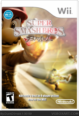
[ Box updated on January 30th, 2009 ] [ original ]
 Super Smash Bros. Brawl Box Cover Comments
Comment on DuckD0nald's Super Smash Bros. Brawl Box Art / Cover.

[ Box updated on January 30th, 2009 ] [ original ]
Comment on DuckD0nald's Super Smash Bros. Brawl Box Art / Cover.
This is my first box on this site. I think it looks kinda decent for a first.
Credit to Crayon Man for the template.
[ Reply ]
Pretty decent but far from good. The placement is really weird and the background could have been more exciting.
[ Reply ]
Keep up the good job! since it's your first box I'll be mild bout the negative points... :)
[ Reply ]
Put DK's face down, and erase the "Nintendo's best on blablabla", and it should be great.
[ Reply ]
Updated! Erased all the ugly faces, added a new, more exciting background and added a few effects to it. #4, I did the first thing but the second thing... I changed it to "Nintendo's best in 4-player action now on the Wii!" I didn't notice your comment because I was updating the box. And by the way, this was made in Paint.NET
Edited at 1 decade ago
[ Reply ]
I love this new one. 5/5 +fav.
[ Reply ]
#6, Thanks!
[ Reply ]
this looks much better then version 1!
3.5/5
make a Back! then i give maby a 4/5.
[ Reply ]
#8, I tried it, but it just ended up ruining the whole box.
[ Reply ]
link
Sigh...
[ Reply ]
link
Sigh...
[ Reply ]
#1? Kinda decent? I'ts slightly more than decent, it's pretty good for a first. Its all blurred and messy. Logo, temp and WiFi Logo is blurred and/or jagged. And Impact on the box? Background is amazing however.
Edited at 1 decade ago
[ Reply ]
#10, I didn't only use this wallpaper. I added some effects as well, and it did take some effort. Looking for the logos and recoloring the Nintendo logo is doing something.
And #12, It's the effects. And about Impact, what font was I supposed to use then? The logo is jagged and blurred because it was too big, and Magic Wand just cropped it like that, and I tried to smooth it out.
Edited at 1 decade ago
[ Reply ]