o_O I am speechless...I am without speech. Wonderful job, especially on the art book. The blue color scheme on the front case looks great and the design on the back fits so well with the game. This is why you're one my favorite authors here. :)
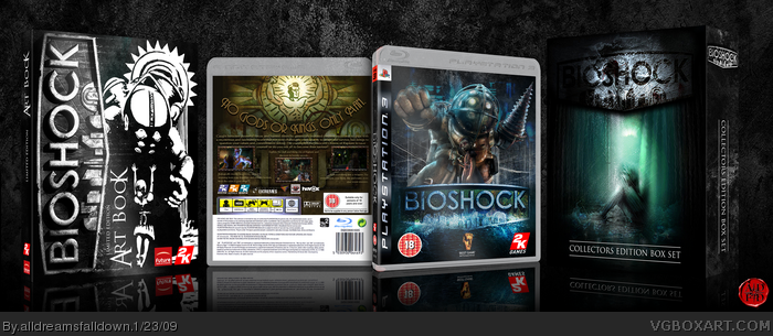
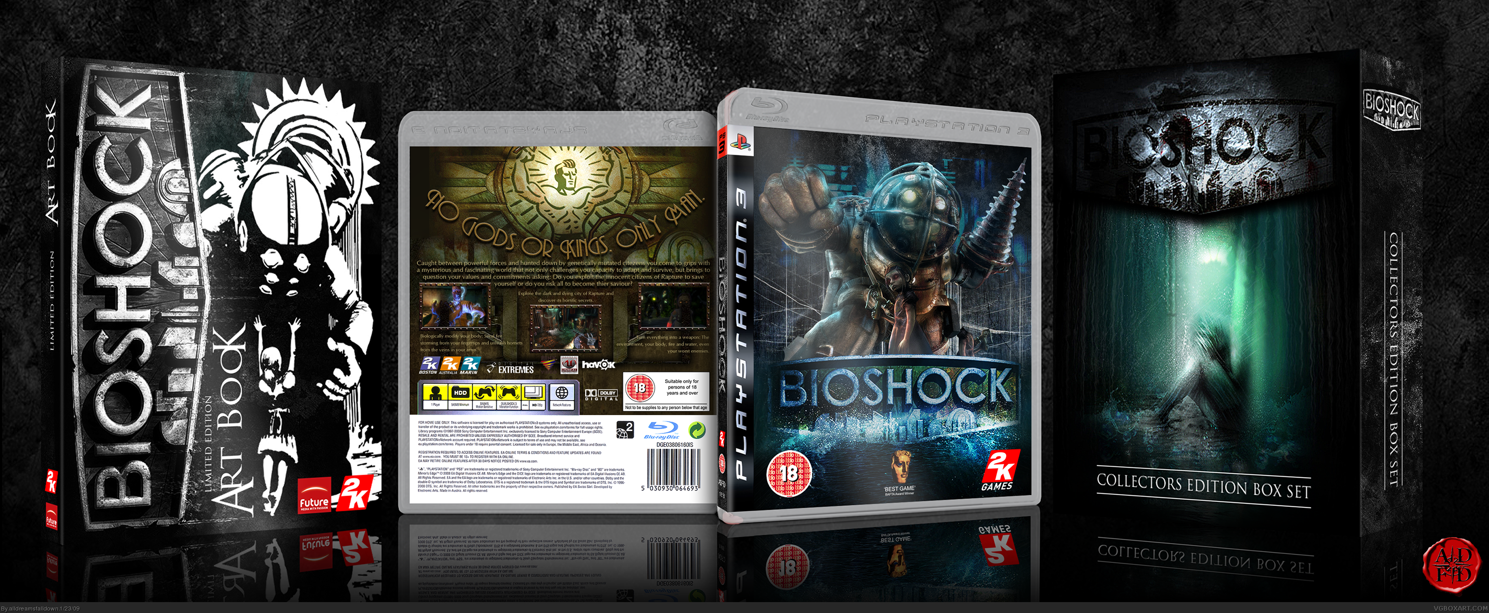
The colours of the font are supposed to represent the harsh, cold outside of Rapture and the back the warm tones of the inside. That's what I was going for anyway.
I gotta say I love what you did with the back, and thank Jesum for the tagline being different. The front of the collector's box itself is what I like most though.
I don't think I have a chance, haha. Just uploaded mine ... in kinda a rush near the end cause deadline was nearing and had studying to do for exams ...
Holy shit...
This is box is amazing. It's very quality work and probably the best BioShock cover out there. Wonderful job.
If any cover deserves to be in the hall of fame, it's this.
masterpiece...
keep up the great job
just thought that the theme (color scheme) is not consistent, are you trying out different variations~
great job anyway :P
 BioShock Box Cover Comments
My round 2 competition box against YoshiStar. Credit to jdstone for the Big Daddy/Little Sister image on the art book.
[ Reply ]
...wow.
[ Reply ]
Yep yep yep
this is very clean and innovative
[ Reply ]
o_O I am speechless...I am without speech. Wonderful job, especially on the art book. The blue color scheme on the front case looks great and the design on the back fits so well with the game. This is why you're one my favorite authors here. :)
Edited at 1 decade ago
[ Reply ]
holy shizzwangers... and that's a word I made up, just for this box
[ Reply ]
#5, Yeah, it deserves that. Awesome job ADFD!
[ Reply ]
I would preety much feel like shit if i was yoshi, this would be an interesting round! XD awsome box dude :)
[ Reply ]
Oh No!!!!! LK chopped off the head of the girl next to bigdaddy!
[ Reply ]
#8, oops spotted it and fixed. Thanks.
Edited at 1 decade ago
[ Reply ]
Looks official..
[ Reply ]
#9, link seeeeeee!!!?!??1one?!!
[ Reply ]
wow, great job ADFD!
[ Reply ]
Front cover and Art Book are awsome! I don't realy like the back cover, but front is incredible :) I like it very much!
+ Fav
[ Reply ]
Talk about bustin a nut...
[ Reply ]
The colours of the font are supposed to represent the harsh, cold outside of Rapture and the back the warm tones of the inside. That's what I was going for anyway.
Edited at 1 decade ago
[ Reply ]
Agreed with Spike. I don't think the back cover is quite as good as the rest. But it is still great, +fav
[ Reply ]
I gotta say I love what you did with the back, and thank Jesum for the tagline being different. The front of the collector's box itself is what I like most though.
[ Reply ]
HOF as usual...
[ Reply ]
Nice!!!!
Well I can't wait to start making a box!!!
[ Reply ]
Amazing.
[ Reply ]
Dude. You brought the THUNDER on this one. WOW!
[ Reply ]
I approve.
[ Reply ]
nice!
[ Reply ]
this fried my brain balls! i shalt fav!
[ Reply ]
Beat me. Hahaha. Nice!!
I don't think I have a chance, haha. Just uploaded mine ... in kinda a rush near the end cause deadline was nearing and had studying to do for exams ...
edit: can't get over this box's awesomeness. o.o
Edited at 1 decade ago
[ Reply ]
Simply Amazing 100000 out of 10 awsome job
[ Reply ]
Nice!! i like the box collector!! ^^
[ Reply ]
Holy shit...
This is box is amazing. It's very quality work and probably the best BioShock cover out there. Wonderful job.
If any cover deserves to be in the hall of fame, it's this.
Edited at 1 decade ago
[ Reply ]
whoa...
[ Reply ]
holy fuck
[ Reply ]
masterpiece...
keep up the great job
just thought that the theme (color scheme) is not consistent, are you trying out different variations~
great job anyway :P
[ Reply ]
I think I just came.
[ Reply ]
you know what would have been better? If it had Bioshock 2 also and both of them were in 3D! :D
[ Reply ]
nice!
[ Reply ]