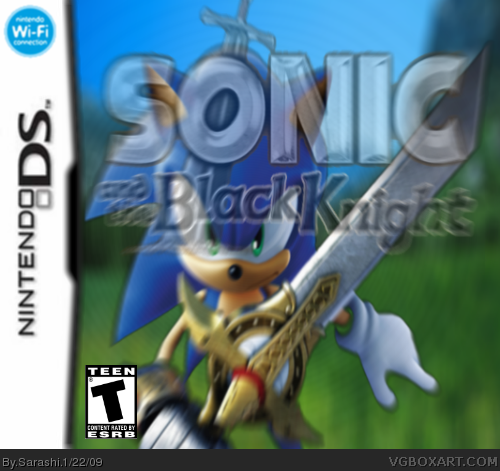
Please. I have tried the least on this one. I have to give credit again to...
VGBOXART (Sonic Render and Logo)
GOOGLE IMAGES (DS)
ESRB (Logo)
Again. I have went mad with the blur function. Please could you NOT critisise the Teen logo, Blurring and the Sega logo not being apparent. Please could you also give a rating out of 5 (Ergo, 1/5 Etc)
I'm very sorry if I have offended you in this message, but I am fed up with people telling me to stop using the blur function. I require it. Sorry for the inconvenience of reading this. For all people who are not affected, please do as you please.
I think that it is just too simple. There isn't a unique aspect that hasn't really been seen before, except that it is on the DS Box (which would be awesome by the way). The background is pretty simple, and Sonic is in the same pose he is always in. I shan't comment on the blur function. The logo may be too transparent as well, you may want to darken it a little bit. I suppose 2.5/5. Can you let me know how to make things transparent? That is cool.

 Sonic and the Black Knight Box Cover Comments
Please. I have tried the least on this one. I have to give credit again to...
VGBOXART (Sonic Render and Logo)
GOOGLE IMAGES (DS)
ESRB (Logo)
Again. I have went mad with the blur function. Please could you NOT critisise the Teen logo, Blurring and the Sega logo not being apparent. Please could you also give a rating out of 5 (Ergo, 1/5 Etc)
I'm very sorry if I have offended you in this message, but I am fed up with people telling me to stop using the blur function. I require it. Sorry for the inconvenience of reading this. For all people who are not affected, please do as you please.
Very sorry, Sarashi
[ Reply ]
The blur makes my head ache, and the transparency of the logo annoys me. 1.5/5
Edited at 1 decade ago
[ Reply ]
You basically asked us not to criticize everything that's wrong with it...
[ Reply ]
I think that it is just too simple. There isn't a unique aspect that hasn't really been seen before, except that it is on the DS Box (which would be awesome by the way). The background is pretty simple, and Sonic is in the same pose he is always in. I shan't comment on the blur function. The logo may be too transparent as well, you may want to darken it a little bit. I suppose 2.5/5. Can you let me know how to make things transparent? That is cool.
[ Reply ]
the render was found on google? It's mine, but I won't get angry. I agree with #4 mostly.
[ Reply ]
#5, oh, but when I use your supposed render, you blow a bitch over it...
[ Reply ]
I expected this to happen...
[ Reply ]
#4, I use Paint.NET. I use zoom blur to make it look fast or blurred, then I go to the layers bar, and click the 'Transparancy' Button and reduce it.
[ Reply ]
Maybe make the logo smaller, I can't see his head now...
[ Reply ]
The logo is way too big, you can barely see his face.
[ Reply ]
#10; #9 K, I've fixed it. Whadd'ya think?
[ Reply ]
#11, Good... But, No Dev Logo?
[ Reply ]