#3 Im not saying its a big deal, im just saying it doesn't look right...
But hey! Each to their own.
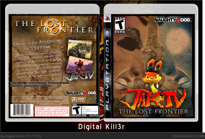
Besides that, the box looks pretty decent. I especially like the back 4/5
#6, Well, your last box wasn't really the best effort.....so to be honest.....I was expecting this box to be pure crap. I was hoping you would've put effort into this box, and you didn't disappoint.
 Jak IV: The Lost Frontier Box Cover Comments
Credits:
JB for the renders and logo.
Sens for the temp.
And ka-boom! Here's my Jak 4 box.
[ Reply ]
Are the ESRB and Developer logos meant to be a joke?
[ Reply ]
#2 I put the ESRB and the Developer Logo on top because I wanted the Jak logo on the bottom. I don't think it's such a big deal :/
[ Reply ]
#3 Im not saying its a big deal, im just saying it doesn't look right...
But hey! Each to their own.
Besides that, the box looks pretty decent. I especially like the back 4/5
[ Reply ]
Hey, the box really isn't that bad at all!
[ Reply ]
#5 Who the hell said it was bad?
[ Reply ]
#6, Well, your last box wasn't really the best effort.....so to be honest.....I was expecting this box to be pure crap. I was hoping you would've put effort into this box, and you didn't disappoint.
[ Reply ]
Thanks for the credit. Daxter is a bit blurry, but not too bad at all.
[ Reply ]
#7 To be honest, I put in 0 effort in my last box. I made it just for a quick laugh.
[ Reply ]
I like it more than my attempt at this. I might have another shot at it...
[ Reply ]