Awesome. I think the Final Fantasy logo on the front could move a tad to the right. Outside of that, justify the description text on the back, and BAM! You're set.
Agreed with RayBlade on the logo. Anyway The back is bugging me, it's too plain. I know that's what they looked like, but it's okay to experiment. Put some more art together and cut out the big black area on the back and make something interesting. I guess you don't have to, but I'd find it much more appealing.
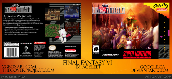
 Final Fantasy VI Box Cover Comments
Huge thanks to ShingoTM from deviantart.com
Took about a week on and off, everything else from google I belive.
Hope you like!
C/C wanted.
[ Reply ]
Awesome. I think the Final Fantasy logo on the front could move a tad to the right. Outside of that, justify the description text on the back, and BAM! You're set.
Nice Work. :)
[ Reply ]
This is really good, I love the front. +fav
[ Reply ]
Thanks rayblade and spiderpig :)
Wow and thanks so much for the favs everyone!
Edited at 1 decade ago
[ Reply ]
i love how you make retro box's look official i love it +fav
[ Reply ]
very good, it has a retro, yet official look, just like GrahamZ said!
Fav!
[ Reply ]
Retroficial eh? ahhaa
and thanks :)
and thanks to everyone for the favs!
[ Reply ]
More attention please :)
seriously, this box is pretty awesome
[ Reply ]
YA THIS BE COOL
I PLAYED THIS GAME ON CHRISTMAS WITH MY SISTER LOL!
[ Reply ]
thanks M G :D
Uh that's cool #9, it's a very fun game haha..
[ Reply ]
YA
I LIKE WHEN THE CLOWN LAUGHS AND STUFF
WOOOP WUP WUP WUP WUP
LOL SO FUNNY YA?
[ Reply ]
Agreed with RayBlade on the logo. Anyway The back is bugging me, it's too plain. I know that's what they looked like, but it's okay to experiment. Put some more art together and cut out the big black area on the back and make something interesting. I guess you don't have to, but I'd find it much more appealing.
Also, it seems blurry.
Edited at 1 decade ago
[ Reply ]
#11, That's Kefka for you.
#12, I will try to change the back up, I don't know where your getting the blurriness from though lol
Thanks for the critique.
[ Reply ]
whoa, this looks really cool!
[ Reply ]
thanks :D
[ Reply ]
#13, The text is blurry in full view.
[ Reply ]
Which text?
Nothing is blurry for me :/
[ Reply ]
Nice job!
[ Reply ]