Strange.... the front looks so much like the official. Yet at the same time, they look nothing alike!
The logo could be alot bigger but other than that, I really love it! The 2K logo looks great too! Amazing job.
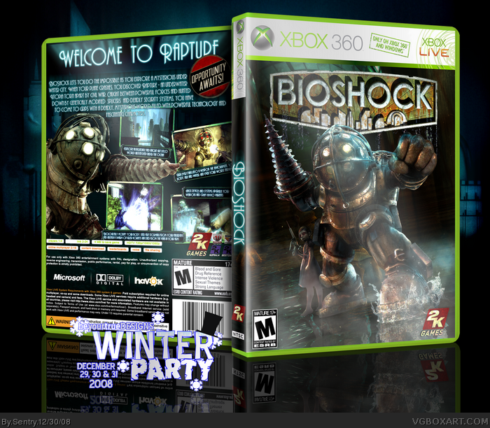
It's cool, but you should have the text on the back in lower case. It looks hard to read. And you should really get rid of that part of the back info where you have the Microsoft and Havok logos and stuff, you'd save up a lot of space, because right now it looks kinda crowded. Maybe the logo could be a tad bigger, but... it looks pretty good. 4/5
This is great but it does look alot like other BioShock boxes. I'm starting to get annoyed of how many BioShock and Sonic boxes are being made. I'm not saying that they look bad but most of them look the same. I can deal with heeps of halo boxes because i like halo. anyway +fav but i think the writing on the back shouldn't be in that text.
 BioShock Box Cover Comments
My second BYTD party box. I was going for the official look this time around. Enjoy!
credit to Sp-6 for template.
[ Reply ]
this looks great man. 5/5
[ Reply ]
Strange.... the front looks so much like the official. Yet at the same time, they look nothing alike!
The logo could be alot bigger but other than that, I really love it! The 2K logo looks great too! Amazing job.
Edited at 1 decade ago
[ Reply ]
It's cool, but you should have the text on the back in lower case. It looks hard to read. And you should really get rid of that part of the back info where you have the Microsoft and Havok logos and stuff, you'd save up a lot of space, because right now it looks kinda crowded. Maybe the logo could be a tad bigger, but... it looks pretty good. 4/5
[ Reply ]
#3, 2K beats Sentry to the punch? Lol.
Edited at 1 decade ago
[ Reply ]
Awesome, as Cerium said: So much like the official but at the same time totally different. +fav
[ Reply ]
#4, Thats just how the font is. I could change it but nothing else fits.
$5, lol, thanks.
[ Reply ]
I dont mean to offend you but Im not going to fave it. It looks like every other Bioshock box on the site.
[ Reply ]
Updated. Made the logo bigger.
[ Reply ]
#9 Awesome!! I love it when people actually take note of criticism and the update their boxes with it =]
[ Reply ]
Looks cool... I won't look at V1, as V2 looks the biz.
[ Reply ]
You went for official, and you nailed it man! this looks better than the official to me!
[ Reply ]
Thanks for the feedback guys! :)
[ Reply ]
I love the back! :)
[ Reply ]
#14, Thanks!
[ Reply ]
I like it. the only complain is about the glow of the box! It's too much as for my taste :)
+ Fav
[ Reply ]
This is great but it does look alot like other BioShock boxes. I'm starting to get annoyed of how many BioShock and Sonic boxes are being made. I'm not saying that they look bad but most of them look the same. I can deal with heeps of halo boxes because i like halo. anyway +fav but i think the writing on the back shouldn't be in that text.
[ Reply ]
I don't know, I'm not really feeling it. D=
[ Reply ]
WOAH! me like FAV!
btw, i deleted the kirby ultimate collection box and re-uploaded it as an update, so can you refave adn comment it thanks alot :)
[ Reply ]