The back is nice, love the image borders, thats sweet. One the front, I feel its too 'dirty' for Final Fantasy, if you know what I mean, I think that there are too many scanlines and stuff on it. The back design is nice though. Good effort.
you could probably change the canvas colour to something a little darker, because with all the blue and white everything mixes up and it's a little hard on the eyes... but, it's awesome.
#14, Thank V, the colors that represent Cloud are probably blue and white, the alternative would be black and red or orange (sephiroth) but i just wanted it to make sense. Thanks!
i like it alot for its cleanliness and sleakiness. however, the grid box idea for ffviiAC is beginning to get stale, but i think you were able to pull it off.
#16, that's kinda rude, i hope you didn't actually mean to say that. and you really meant "could not be made better"... as if it's already too good to get any better? idk but wow sounded rude.
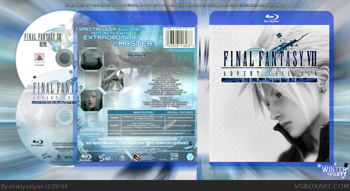
 Final Fantasy VII: Advent Children (Complete) Box Cover Comments
Finally got it to look the way i wanted it too, so i had to finish it. Enjoy!
Forgot to mention, i made this Blu-ray temp out of my PS3 temp :D
Edited at 1 decade ago
[ Reply ]
This is cool.+fav
[ Reply ]
Pretty good but not my fav from you, sorry.
Edited at 1 decade ago
[ Reply ]
The blue and white are rocking Shady. Super job man!
[ Reply ]
Damn, looks great.
[ Reply ]
#4, LIKE THE FLAG OF FINLAND o/
Pretty cool box you got there my friend! Front seems to lack something but i love the back!
[ Reply ]
Wow, this looks really awesome
[ Reply ]
Superb.
[ Reply ]
Holy shit... O.O
The sweetest eye candy! =P Awesome job Shady. ;)
[ Reply ]
#6, For the front i wanted to keep it simplistic , but keep clouds emotion out in the open.
[ Reply ]
Fav'd!
I had even forgot to author-fav you! :O
Done now :P
[ Reply ]
Its been growing on me but Id like to see some more color on the front though. +fav
Edited at 1 decade ago
[ Reply ]
The back is nice, love the image borders, thats sweet. One the front, I feel its too 'dirty' for Final Fantasy, if you know what I mean, I think that there are too many scanlines and stuff on it. The back design is nice though. Good effort.
[ Reply ]
you could probably change the canvas colour to something a little darker, because with all the blue and white everything mixes up and it's a little hard on the eyes... but, it's awesome.
[ Reply ]
#14, Thank V, the colors that represent Cloud are probably blue and white, the alternative would be black and red or orange (sephiroth) but i just wanted it to make sense. Thanks!
[ Reply ]
could not be made worse
[ Reply ]
i like it alot for its cleanliness and sleakiness. however, the grid box idea for ffviiAC is beginning to get stale, but i think you were able to pull it off.
#16, that's kinda rude, i hope you didn't actually mean to say that. and you really meant "could not be made better"... as if it's already too good to get any better? idk but wow sounded rude.
Edited at 1 decade ago
[ Reply ]
if it were real, i'd get it just for the demo! lol. jk, jk. 5/5, great job
[ Reply ]
#17, #18, Thanks you two!
[ Reply ]