The logo is needlesly stretched and put in a place where it would have to be manipulated quite a bit and makes it worse, and yet the ESRB and devs are awesome!
6- Much better, but try un-stretching it
#3, Im revoking your abilitiy to post critique from now on.
The Dev logos are not awesome, the ESRB is much to close to the template, and the ubisoft dev logo has rough cutting edges. The box in general is quite stretched, I am sorry Shadow but you are in no place to call someone a troll when you have 78 boxes that dont show much improvement.
Now for the box overall, its not very good but there has been worse; you have the basic premise (just make sure everything is porportional next box around) and try playing around with effects) =)
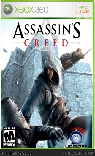
 Assassin's Creed Box Cover Comments
the logo goes under the template.
[ Reply ]
Credit to crayon man for template.
please rate and give critisize constructively
[ Reply ]
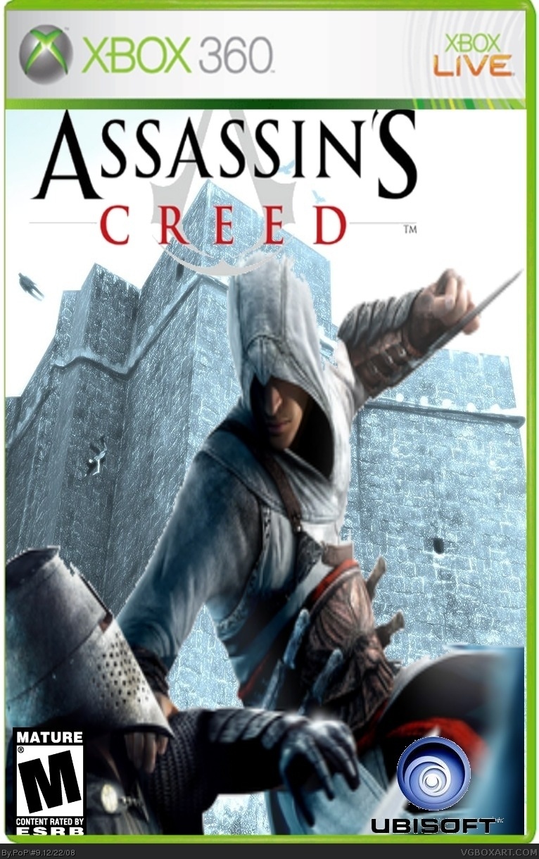
The logo is needlesly stretched and put in a place where it would have to be manipulated quite a bit and makes it worse, and yet the ESRB and devs are awesome!
6- Much better, but try un-stretching it
Edited at 1 decade ago
[ Reply ]
#1 it is
#2 i didnt notice the logo would be like that. And now i update
Edited at 1 decade ago
[ Reply ]
#3, Im revoking your abilitiy to post critique from now on.
The Dev logos are not awesome, the ESRB is much to close to the template, and the ubisoft dev logo has rough cutting edges. The box in general is quite stretched, I am sorry Shadow but you are in no place to call someone a troll when you have 78 boxes that dont show much improvement.
Now for the box overall, its not very good but there has been worse; you have the basic premise (just make sure everything is porportional next box around) and try playing around with effects) =)
[ Reply ]
update again this time i moved esrb up a little
[ Reply ]
pretty generic imo.
[ Reply ]
#7 whats a imo
[ Reply ]