Phew, finally done, this took all day... anyway, credit goes to:
~Sens for the template.
~Planet Renders For the logo and render of the guy on the back.
~Google for the backgrounds, back screenshots and Rockstar logo.
~Paint.NET (lol)
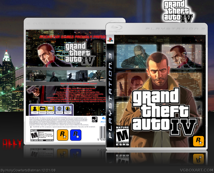
#2, Aren't all GTA boxes backs plain? LOL! Anyway, with the back, I decided to have it like the traditional ones (black background, red text and a few screenshots) and customise it (gradient, character, glow).
 Grand Theft Auto IV Box Cover Comments
Phew, finally done, this took all day... anyway, credit goes to:
~Sens for the template.
~Planet Renders For the logo and render of the guy on the back.
~Google for the backgrounds, back screenshots and Rockstar logo.
~Paint.NET (lol)
I hope you all like it!
[ Reply ]
the front is very nice.
but the back is plain.
over all a good 4/5.
[ Reply ]
#2, Aren't all GTA boxes backs plain? LOL! Anyway, with the back, I decided to have it like the traditional ones (black background, red text and a few screenshots) and customise it (gradient, character, glow).
EDIT: The forgotten credit:
~DeviantART for the front render!
Edited at 1 decade ago
[ Reply ]
Good to see you not doing a Sonic box. Anyway, looks pretty good for the most part.
I don't like that you have the same character on the front and the back (excuse me, I don't play GTA) and the glow on the text is bad.
If someone on DeviantART did that art on the front, credit the user from DeviantART instead of just the entire site, please.
[ Reply ]
#4, The glow looks alot better in full view. And credit to WestDesing for the front render of Niko! :)
[ Reply ]
#5, Thanks for the crediting there. Anyway, I did look at full view, tighten the glow so it's not so big and it will look better.
[ Reply ]
#6, I can't, I've flattened it... could you comment on the rest of the box, what do you think of the front?
Edited at 1 decade ago
[ Reply ]
This is a PAL template...
You live in UK you should know.
Anyway, front seems "okay", back is mega bland.
[ Reply ]
#8, Sorry, I don't own a PS3.
Read #3.
[ Reply ]
I love the front, but the back is a little plain. Maybe re-design the back? +faved for the front
[ Reply ]
#10, Glad you liked the front, it took me ages to figure out the whole fading thing on Paint.NET, the back... again, I'm gonna say, read #3. :)
[ Reply ]
super!
[ Reply ]
#12, Thank you.
[ Reply ]
Front looks good. Though I do agree with putting more elements on the back. Try decreasing the size of the outer glows too. ;)
[ Reply ]
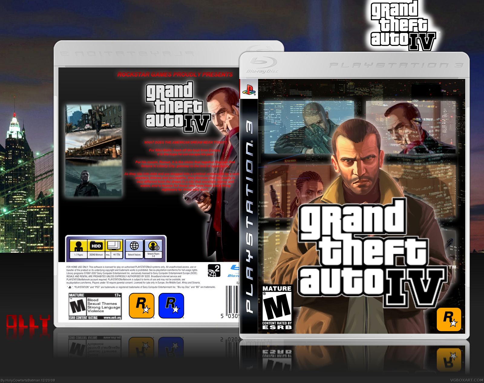
YAY!!! UPDATED THE BACK!!! IT IS NO LONGER BLAND AND BORING (I hope)!!! Hope you guys like!
#14, Ladykiller... likes... my boxes..? *faints* :D
Edited at 1 decade ago
[ Reply ]
Awesomazing
[ Reply ]
#16, Awesomazing... nice word! ;)
[ Reply ]
The front is pretty good, but I really dislike the typography on the back.
[ Reply ]
#18, Are you viewing it in full view, if not, try it, it works! :)
[ Reply ]
shit its shit
[ Reply ]
#20, Do you wanna know something? I don't care!
[ Reply ]
Every time someone comments you comment back, stop the endless bumping! It's ok though I don't like the backgrounds.
[ Reply ]
I think this would have been top notch work if the text on the back was white.
[ Reply ]
#22, It's... not bumping...
Oh, and Ray, thank you, I shall work on that very soon.
[ Reply ]
Love this :) better than the official box art
[ Reply ]
#25, If you like this you'll love my most recent ones.
[ Reply ]