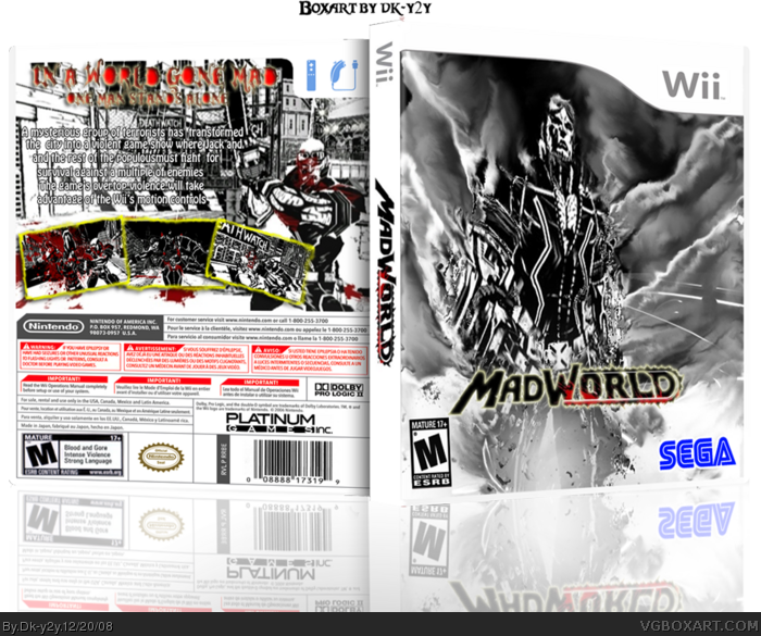
If I were you I would take more inspiration from the Sin City comics. I guess the rest is Okay, although the logo feels a bit weirdly placed and designed.
It's a good attempt, but everything is grainy, even in the initial view.
The description text looks weird, and has to many filters on it, and the logo should be a lot more prominent.
 MadWorld Box Cover Comments
This is my second box art. Please rate and give some criticism.
[ Reply ]
very good wat program are you using
[ Reply ]
If I were you I would take more inspiration from the Sin City comics. I guess the rest is Okay, although the logo feels a bit weirdly placed and designed.
[ Reply ]
The reason the logo is placed in a bad position it is because I have nowhere to find :(
[ Reply ]
It's a good attempt, but everything is grainy, even in the initial view.
The description text looks weird, and has to many filters on it, and the logo should be a lot more prominent.
[ Reply ]
I will edit it right now.
[ Reply ]
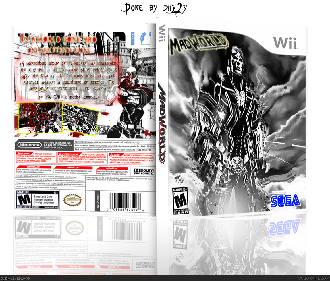
Updated,version 3 added. Is it any better?
[ Reply ]
Updated,version 3 added. Is it any better?
Edited at 1 decade ago
[ Reply ]