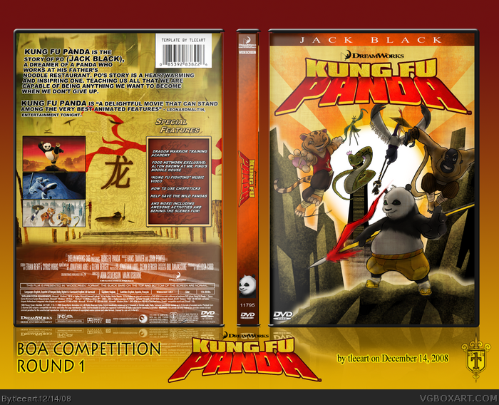
My first DVD box. I wanted to do something special for this occasion, so I hand drew the pretty much everything on the front, save the logos and type.
Somehow this is the first Kung Fu Panda DVD box on the site! I was kind of surprised.
I put a hell of a lot of time and thought into this. I grabbed the credits information from the official Kung Fu Panda box. The image for the background of the back is from the opening sequence of the film, where Po is dreaming. I just grabbed screens and patched it together.
If you guys don't like it, fine, but please don't be insulting with your critiques on this.
I truly call this a labor of love. Hopefully I can reach Round 2 of the BOA comp. with this.
wow your amazing at boxes and your are an incredibly good artist. Did you really draw all this your self? because this looks like the work of a professional artist. +fav one of the best boxes on the site!
I'm glad this hit a little better with people than my last hand drawn box. ;)
I get why Trev says what he says about my templates now, and starting with this one, I'll fix it in a day or two, I will do the plastic in a more correct way. Thanks for everybody who gave me ideas on how to fix it up.
#7, I still think that his name should be bigger, but I'll see about dropping the size of the text so it's not AS big as my mentions of the Kung Fu Panda name.
#9, The front image is my artwork, drawn all in Photoshop with my tablet.
#10, I understand. I almost scrapped my front because of how much I like the art style, too. I think I'll have to do another Kung Fu Panda box sometime.
#12, I truly did draw everything on the front (minus logos and type), my other work can be found here: link
Wow, HoF, I REALLY didn't expect to get it on this one! Thanks to everybody who commented and faved!!! I'm glad I bumped up the effort more when I made the renders this time!
btw, I'm still going to fix the template as I said I would.
#4, If you don't see them your blind. I understand when people take a couple pixels of the front and back to show its round but they also have the glow in between to show where the light is. Your lighting is a uncentered white rectangle with a 30% opacity. On the spine you have nothing above the art and on the corners of the front and back. Your images don't fit. Its as if you made this looking at it with a 50% zoom. You need to zoom in and look for mistakes. I clearly point to all the spaces, bad editing or lack of lighting in this picture.
#25, I do have problems with my vision, but I'll not use that as an excuse.
You are exactly right in your analysis of my errors. This is what I would hope to see when people say I screwed up, or just an explanation further if I don't understand.
Other's have mentioned it, too. So, with that said, and as I mentioned above, I do plan on fixing it.
I'm going to research good people here when it comes to plastic in their presentations and try to apply it to my own.
Believe me, I don't take it as an insult, thanks for pointing it out to me.
#26, I have AIM and I'm always willing to help someone. If you have AIM come to me before you upload and I can either help your positioning or critique it so you know. Its not a bad box it just needs to be moved around a little.
Front looks great. But the back design feels very empty for me. This is largely due to the fact that there is no coherency in the overall design and layout. There is no unifying factor, thought, or even theme that ties the whole design together.
Couple that with the absence of a strong tagline to capture my eyes first hand or any element that takes that place, as well as issues in transitioning between the upper yellow part and bottom brownish part makes it a very weak back design.
 Kung Fu Panda Box Cover Comments
My first DVD box. I wanted to do something special for this occasion, so I hand drew the pretty much everything on the front, save the logos and type.
Somehow this is the first Kung Fu Panda DVD box on the site! I was kind of surprised.
I put a hell of a lot of time and thought into this. I grabbed the credits information from the official Kung Fu Panda box. The image for the background of the back is from the opening sequence of the film, where Po is dreaming. I just grabbed screens and patched it together.
If you guys don't like it, fine, but please don't be insulting with your critiques on this.
I truly call this a labor of love. Hopefully I can reach Round 2 of the BOA comp. with this.
Let me know what you think!
Edited at 1 decade ago
[ Reply ]
Why does all your boxes never fit your template? Its cool but you really need to fill in all those spaces.
[ Reply ]
very nice job. love the front :)
[ Reply ]
#2, It looks right to me, sorry. As for the "spaces" you're talking about, I don't have a clue what you are referring to.
#3, Thanks!!
Edited at 1 decade ago
[ Reply ]
Kick-ass ;)
[ Reply ]
EDIT: Damn double-post.
Edited at 1 decade ago
[ Reply ]
Love it.
However I do think (Jack Black)
should be the same size as the rest of the font used in the description, not larger. I don't know why..
Edited at 1 decade ago
[ Reply ]
#2, i think its due to him/her not selecting the glow on the template?
so it always goes short ?
[ Reply ]
He means the borders of your template don't go all the way to the plastic. Try a glow so that it looks more complete.
Anyways, the box is pretty sweet. Where did you get that front image?
[ Reply ]
it looks pretty sweet!
However, i do like the clean style of the original art alot more.
Nonetheless, an awesome box.
kudos !
[ Reply ]
this box is really sweet!
[ Reply ]
wow your amazing at boxes and your are an incredibly good artist. Did you really draw all this your self? because this looks like the work of a professional artist. +fav one of the best boxes on the site!
[ Reply ]
this is incredible! :D
[ Reply ]
Whoa!! Awesome!!
[ Reply ]
This is amazing, one of your best. +fav
[ Reply ]
story of poo interesting.... just joking. This is teh 4WSUM!!!1!!
[ Reply ]
This is completely awesome! :D
[ Reply ]
I'm glad this hit a little better with people than my last hand drawn box. ;)
I get why Trev says what he says about my templates now, and starting with this one, I'll fix it in a day or two, I will do the plastic in a more correct way. Thanks for everybody who gave me ideas on how to fix it up.
#7, I still think that his name should be bigger, but I'll see about dropping the size of the text so it's not AS big as my mentions of the Kung Fu Panda name.
#9, The front image is my artwork, drawn all in Photoshop with my tablet.
#10, I understand. I almost scrapped my front because of how much I like the art style, too. I think I'll have to do another Kung Fu Panda box sometime.
#12, I truly did draw everything on the front (minus logos and type), my other work can be found here: link
[ Reply ]
#18 then it truly is amazing!
[ Reply ]
Amazing.
[ Reply ]
Looks awesome sir! Your artwork for this one came out really good. A lot of nice shading, especially on the background.
[ Reply ]
Wow, HoF, I REALLY didn't expect to get it on this one! Thanks to everybody who commented and faved!!! I'm glad I bumped up the effort more when I made the renders this time!
btw, I'm still going to fix the template as I said I would.
Edited at 1 decade ago
[ Reply ]
This got in the Hall fast, good job Tleeart!
[ Reply ]
#22 well you should of! It is very very special and a massive congratulations on your latest and well deserved hall of fame. :)
[ Reply ]
#4, If you don't see them your blind. I understand when people take a couple pixels of the front and back to show its round but they also have the glow in between to show where the light is. Your lighting is a uncentered white rectangle with a 30% opacity. On the spine you have nothing above the art and on the corners of the front and back. Your images don't fit. Its as if you made this looking at it with a 50% zoom. You need to zoom in and look for mistakes. I clearly point to all the spaces, bad editing or lack of lighting in this picture.
link
Want me to point out more (not to be mean) but to help you with placement?
[ Reply ]
#25, I do have problems with my vision, but I'll not use that as an excuse.
You are exactly right in your analysis of my errors. This is what I would hope to see when people say I screwed up, or just an explanation further if I don't understand.
Other's have mentioned it, too. So, with that said, and as I mentioned above, I do plan on fixing it.
I'm going to research good people here when it comes to plastic in their presentations and try to apply it to my own.
Believe me, I don't take it as an insult, thanks for pointing it out to me.
[ Reply ]
Awesome! I love the finished look! The Furious Five and Po look great, and the back is uber too! I love Mantis especially! Total fave. <3
[ Reply ]
#26, I have AIM and I'm always willing to help someone. If you have AIM come to me before you upload and I can either help your positioning or critique it so you know. Its not a bad box it just needs to be moved around a little.
[ Reply ]
#28, I'll keep it in mind, thanks Trev.
[ Reply ]
Front looks great. But the back design feels very empty for me. This is largely due to the fact that there is no coherency in the overall design and layout. There is no unifying factor, thought, or even theme that ties the whole design together.
Couple that with the absence of a strong tagline to capture my eyes first hand or any element that takes that place, as well as issues in transitioning between the upper yellow part and bottom brownish part makes it a very weak back design.
[ Reply ]
love it
[ Reply ]
that is just EPIC!
[ Reply ]