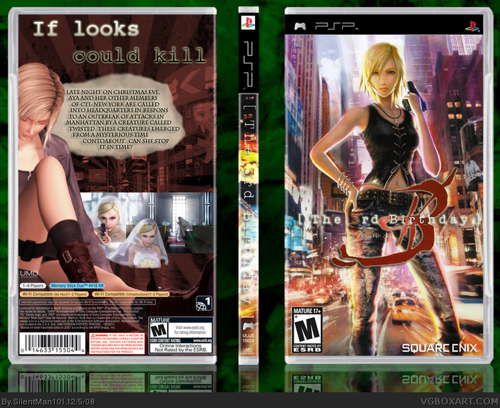
I know I uploaded it kind of late but I wont be able to upload it tomorrow. Anyways there is little to no material for this game and little is known of the plot so I did the best with what I got.
#5, Like I said there is like NO material for this game so I had to take stuff from the other game to make it look good lol
I think the 3D art clashes with the drawn art on the back, but I understand you only have so much to work with. I like both images though, but as a complete box there kind of at odds with one another.
I dig it. It flows a lot better with both character renders in 3D. I might try matching some contrasts though. Maybe saturating the front image and the back 3D render with a red hue?
#7, Thats ok, I have never played any of the games so I wouldn't know what the feel is :) All I knew was that this is a spin off of the Parasite Eve series.
You matched it perfect man. The renders look like they go together now!
It still looks like the design could use a dominant color, but that would be up to you to play around with if you feel it might improve things. I think the blue background on the back is throwing things off a bit, but not that bad. that as well might look better if it was red, to match the color of the city background on the front a little closer.
I like this. This box makes me interested in this game. Maybe I'll look into later on. +FAV Nice work hopefully this gets the credit it deserves because it is HoF material in my book.
Okay, on other parts, I don't know what's up with the screenshot/s on this, looks like it's supposed to be torn? It just looks a little weird. Also, I would put a black/dark stroke around the logo on the spine for better visibility.
It's improving, and though the Parasite Eve 2 Aya still bugs me, I can let it slide for lack of resources.
 The 3rd Birthday Box Cover Comments
I know I uploaded it kind of late but I wont be able to upload it tomorrow. Anyways there is little to no material for this game and little is known of the plot so I did the best with what I got.
#5, Like I said there is like NO material for this game so I had to take stuff from the other game to make it look good lol
Edited at 1 decade ago
[ Reply ]
holy... HoF!
[ Reply ]
I think the 3D art clashes with the drawn art on the back, but I understand you only have so much to work with. I like both images though, but as a complete box there kind of at odds with one another.
[ Reply ]
<3
[ Reply ]
The front is rockin' but I don't like the fact that you used a render from PE2 for the back.
Also, I would like a more typewriter font style for the tagline, like Courier.
[ Reply ]
That is so hot.
[ Reply ]
It doesn't have the Parasite Eve feel at all, sorry.
[ Reply ]
I dig it. It flows a lot better with both character renders in 3D. I might try matching some contrasts though. Maybe saturating the front image and the back 3D render with a red hue?
Edited at 1 decade ago
[ Reply ]
Damn it you beat me to it :) I agree with Pan but I still like the overall look, nicely done.
Edited at 1 decade ago
[ Reply ]
#7, Thats ok, I have never played any of the games so I wouldn't know what the feel is :) All I knew was that this is a spin off of the Parasite Eve series.
[ Reply ]
hot diggidy dog! nice job! lol.
[ Reply ]
You matched it perfect man. The renders look like they go together now!
It still looks like the design could use a dominant color, but that would be up to you to play around with if you feel it might improve things. I think the blue background on the back is throwing things off a bit, but not that bad. that as well might look better if it was red, to match the color of the city background on the front a little closer.
Edited at 1 decade ago
[ Reply ]
I like this. This box makes me interested in this game. Maybe I'll look into later on. +FAV Nice work hopefully this gets the credit it deserves because it is HoF material in my book.
[ Reply ]
#13, Thanks! I hope it does to!
[ Reply ]
Tagline = Better.
Okay, on other parts, I don't know what's up with the screenshot/s on this, looks like it's supposed to be torn? It just looks a little weird. Also, I would put a black/dark stroke around the logo on the spine for better visibility.
It's improving, and though the Parasite Eve 2 Aya still bugs me, I can let it slide for lack of resources.
It's getting better!
[ Reply ]
#15, I have no clue what to do with the screenshots lol And I'll fix the spine
[ Reply ]
I'm not too ecstatic about the back, however the front is pretty bitchin.
[ Reply ]
#17, Yeah I dont like the back much either but hey, what ya gonna do?
[ Reply ]
#18, make it better. >.< lol.
[ Reply ]
i don't really like the screenshots, but the majority of the box is pretty sick :) 4/5
[ Reply ]
i think the update is much better! :D
[ Reply ]
Thanks everyone! I was hoping for more comments though lol
[ Reply ]
Thanks everyone! I was hoping for more comments though lol
[ Reply ]
I see I gots more favs! Thanks!
[ Reply ]
127 points! you're getting closer, kyle! =D
p.s. nice triple post you got going there. xP
[ Reply ]
That's totally hawt. /paris hilton voice
[ Reply ]
#25, That second post was a accident lol and thanks LK
And Thanks for the Hall!
Edited at 1 decade ago
[ Reply ]
Awesome dude! Another HoF! You're rackin' these up pretty quickly! I'm looking forward to more outstanding work!
[ Reply ]
Congrats man
[ Reply ]
#1, excellent work
aya brea powa!
i made my one a few daies ago (added in parasite eve 3rd birthday)
[ Reply ]
#1, No credit to me HARSH
[ Reply ]
#31, Um did you make the temp?
[ Reply ]