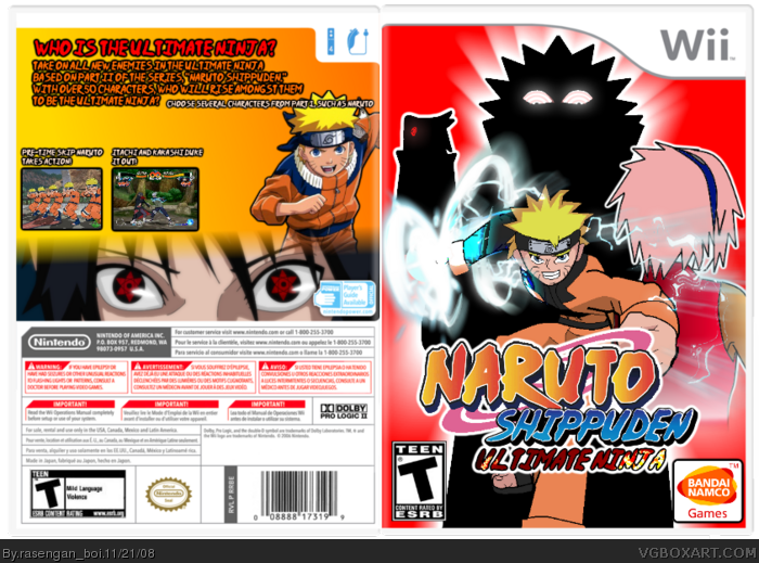
although I appreciate the attempt, you would be better off using original Naruto images rather than your own, it doesn't match Masashi's style. Looks more like Dragonball.
Either the logos are too big or the naruto Shippuden symbol it too low.
The back has nothing to do with shippuden, except the sharingan eyes, which is a major spoiler for the fans who don't read manga.
otherwise it's good, maybe if you didn't use just plain yellow and red for a backgroungd, but now I'm just nitpicking.
Yeah, like #2 said, a gradient in the background, on the front,could make a bit of difference. Also, theres to much empty space on the back, and whats there isn't particularly organized very well.
 Naruto Shippuden: Ultimate Ninja Wii Box Cover Comments
everything on the front ('cept for the dev logos and temp) was made by me, creds to techne for the template
[ Reply ]
although I appreciate the attempt, you would be better off using original Naruto images rather than your own, it doesn't match Masashi's style. Looks more like Dragonball.
Either the logos are too big or the naruto Shippuden symbol it too low.
The back has nothing to do with shippuden, except the sharingan eyes, which is a major spoiler for the fans who don't read manga.
otherwise it's good, maybe if you didn't use just plain yellow and red for a backgroungd, but now I'm just nitpicking.
Edited at 1 decade ago
[ Reply ]
Yeah, like #2 said, a gradient in the background, on the front,could make a bit of difference. Also, theres to much empty space on the back, and whats there isn't particularly organized very well.
[ Reply ]
Use the masashi's Naruto drawings next time ;p
[ Reply ]