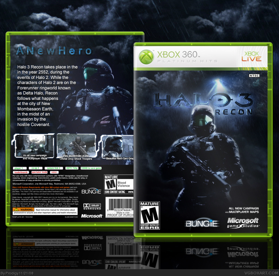
Pretty good. Good presentation...and nice front concept. Main complaint is the image quality as a whole.
Gotta work on the typography on the back too - go for a more suiting font and play with the positioning of the text and tagline. I'd also bump down the screen descriptions a bit so that they're not overlapping the screens since there's still room for them below.
Wow. I'm loving the template especially how well you did the platinum bit. Amazing box. wouldn't be surprised if they asked u to make it official (lol).
 Halo 3 RECON Box Cover Comments
...
[ Reply ]
Wow dude another AMAZING box. +fav
[ Reply ]
Your sex is on fire
[ Reply ]
Pretty good. Good presentation...and nice front concept. Main complaint is the image quality as a whole.
Gotta work on the typography on the back too - go for a more suiting font and play with the positioning of the text and tagline. I'd also bump down the screen descriptions a bit so that they're not overlapping the screens since there's still room for them below.
[ Reply ]
I'm pregnant with Steven's baby. It's his twin.
Ryan's next.
[ Reply ]
#5, Eh?
Anyways, some nice work here, but as LK said, try a more suitable font, and space that tagline out a little.
[ Reply ]
#5, Eh?
Anyways, some nice work here, but as LK said, try a more suitable font, and space that tagline out a little.
[ Reply ]
haha, you alright there Jonas? :P
[ Reply ]
#8, Yeah, I'm fine.
[ Reply ]
It's decent, but I agree with LK.
[ Reply ]
They main problem is that it lacks sharpness. The design is fine.
[ Reply ]
Why are you putting "..." in your opening comment?
[ Reply ]
#12, He doesn't have anything in paticular to say but he wants to make sure that people notice his box. Not that anyone could miss this.
Awesome box. The back does need a bit of work but its nothing too bad. You get a fav from me.
[ Reply ]
nice man
[ Reply ]
#8, Multiple posting syndrome, I think I might have given it to you...better get yourself tested.
[ Reply ]
I love the front, but not so much the back... the tagline and text don't look very good.
[ Reply ]
wwwwwwwwwwwwwwooooooooooooowwwwwwwwwwwww, i like this ;)
[ Reply ]
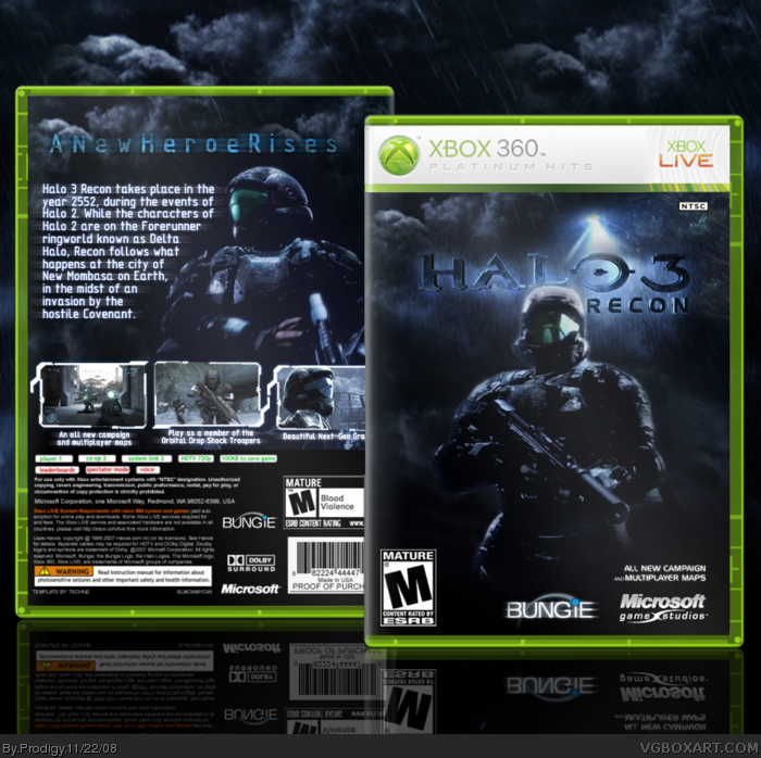
Updated.
[ Reply ]
#5, I... What?
[ Reply ]
Nice, it has a darker feel to it less like the halo series but it contrasts with the green and white. Good choice in colors.
[ Reply ]
Wow. I'm loving the template especially how well you did the platinum bit. Amazing box. wouldn't be surprised if they asked u to make it official (lol).
[ Reply ]
4/5, oh and by any chance can i use that premium hits template?
[ Reply ]
this is really nice :D i like it
just one thing the reflections need sorted out abit they overlap and looks disgusting :(
[ Reply ]
*platinum hits
[ Reply ]
Awesome
[ Reply ]