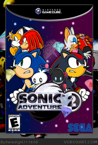
here's a quick box i made credit to the fourms for the temp and sonic art archive for the renders of sonic and gang i made shadow. I tried to make it look like the dreamcast version mostly.
#2 i tried to do somthing about the temp but i couldn't.
Nice editing on Shadow but:
- If its on the Gamecube, you should of used the Sonic Adventure 2 Battle logo
- Sega logo should have a white outline
- Both the Chaos look stretched
- Why only 3 emeralds?
- Eggman looks too small
This same song and dance again. Heh heh. When will you ever learn, kid? Your obsession with birthing these unholy abominations, the visual equivalent of a festering fanfiction written by a mentally diseased dog hit with a sledgehammer, down three flights of stairs, and placing them onto our fair website, is frankly sadistic and an affront to the good users, like myself, who frequent here.
Hm.
Well, what can be said, that I'm sure god hasn't already chastised you for? To begin, your recolor of sonic into shadow does not prove any sort of artistic ability. Why, a child can color within the lines. Instead it only proves your incompetence of doing things the roundabout way, to a lesser effect. The chao's are hideously stretched and deformed, much like your mind must be, so I feel I can't fault you for that fact. The logo is blurry, the emeralds are seemingly pointless, Eggman is too small, and you chose to hid Rouge the Bat so far in the back that you're alienating your demographic for teenage boys, and their young frankfurters showing your complete and utter incompetence of understanding a market. I'd offer something more constructive, but we both know you will not improve. Good day.
7.994/100
 Sonic Adventure 2 Box Cover Comments
here's a quick box i made credit to the fourms for the temp and sonic art archive for the renders of sonic and gang i made shadow. I tried to make it look like the dreamcast version mostly.
#2 i tried to do somthing about the temp but i couldn't.
Edited at 1 decade ago
[ Reply ]
nice, improve the temp though
[ Reply ]
Nice editing on Shadow but:
- If its on the Gamecube, you should of used the Sonic Adventure 2 Battle logo
- Sega logo should have a white outline
- Both the Chaos look stretched
- Why only 3 emeralds?
- Eggman looks too small
[ Reply ]
#3, four emeralds, i'll fix the chaos, make eggman bigger, and change the logo.
Edited at 1 decade ago
[ Reply ]
I'm going to fav ebcuase you did a great job editing Sonic into Shadow.
[ Reply ]
nice. love the shadow. PM?
[ Reply ]
that shadow is pretty sweet
did you doo it????
[ Reply ]
#7,yes.
thanks about shadow, sonic i'll PM it to you.
Edited at 1 decade ago
[ Reply ]
Pretty good, has an anime feel to it, 4/5
[ Reply ]
AWESOME! Could you PM me the Shad?
[ Reply ]
#10, I could make the Shadow
Edited at 1 decade ago
[ Reply ]
This same song and dance again. Heh heh. When will you ever learn, kid? Your obsession with birthing these unholy abominations, the visual equivalent of a festering fanfiction written by a mentally diseased dog hit with a sledgehammer, down three flights of stairs, and placing them onto our fair website, is frankly sadistic and an affront to the good users, like myself, who frequent here.
Hm.
Well, what can be said, that I'm sure god hasn't already chastised you for? To begin, your recolor of sonic into shadow does not prove any sort of artistic ability. Why, a child can color within the lines. Instead it only proves your incompetence of doing things the roundabout way, to a lesser effect. The chao's are hideously stretched and deformed, much like your mind must be, so I feel I can't fault you for that fact. The logo is blurry, the emeralds are seemingly pointless, Eggman is too small, and you chose to hid Rouge the Bat so far in the back that you're alienating your demographic for teenage boys, and their young frankfurters showing your complete and utter incompetence of understanding a market. I'd offer something more constructive, but we both know you will not improve. Good day.
7.994/100
[ Reply ]