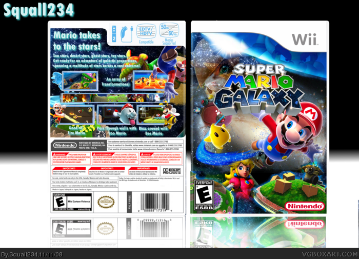
Really nice, but on the back, the "EDTV/HDTV Compatible" and "50 Hz/60 Hz Modes Supported" are PAL logos and shouldn't be used on an NTSC template. Also, I'm not a big fan of the font you used on the back. Other than that, nice job.
Front is awesome. Typography on the back is really bad, the shadow is too light to work effectively and almost makes the text look distorted. Screenshots work but the border on them is a bit thick.
Crazy is all I can do to explain this box. My only gripe (besides maybe being a bit too crazy) is Mario being behind the logo. I'd rather the logo on the front be behind Mario (or just his head).
 Super Mario Galaxy Box Cover Comments
My first Wii cover! Credit to alldreamsfalldown and frenchboy1 for the logo!
[ Reply ]
Oh wow...this is absolutely crazy!
[ Reply ]
#2, You rock Chibi!
[ Reply ]
Man, the same render triple times on the frontpage!
Anyways, I personally think you shouldn't ad effects to Roselina.
[ Reply ]
wow.
[ Reply ]
holy shit
[ Reply ]
this box needs WAY MORE ATTENTION! if only people would look at it, it's HoF worthy!
[ Reply ]
#7, i agree this is amazing.
[ Reply ]
You're getting a little too good.
xD
Really nice, but on the back, the "EDTV/HDTV Compatible" and "50 Hz/60 Hz Modes Supported" are PAL logos and shouldn't be used on an NTSC template. Also, I'm not a big fan of the font you used on the back. Other than that, nice job.
[ Reply ]
wow, this is really, really good
[ Reply ]
#3, ha ha ha, no, you rock more than I do Squall. You're improving! Keep up the fantastic work bro. ^^; I'm loving it! :P
[ Reply ]
#11, mc Donald's song im loving it lol, thanks everyone YOU rock! I'm just hoping that this one ends up in the hall of fame.
Edited at 1 decade ago
[ Reply ]
This is great. Man I remember when I gave you your 1st fav...and now look how far you've gone! YAY! <<claps>>
[ Reply ]
i would love to know how this isn't in the hall yet!
[ Reply ]
holy shit, i wanna see this in the hall so bad!
[ Reply ]
Sorry guys but this will never be in the hall of fame because the visits are over. =[
[ Reply ]
#16, wanna bet? :P
[ Reply ]
C'mon guys...
[ Reply ]
#18, Thanks Chibi but its over.
[ Reply ]
Strokes on back look terrible, nice though.
Edited at 1 decade ago
[ Reply ]
I LOVE THIS! 5/5
[ Reply ]
Thanks=]
[ Reply ]
it looks a lot like the official
[ Reply ]
this is good!
[ Reply ]
Front is awesome. Typography on the back is really bad, the shadow is too light to work effectively and almost makes the text look distorted. Screenshots work but the border on them is a bit thick.
[ Reply ]
Crazy is all I can do to explain this box. My only gripe (besides maybe being a bit too crazy) is Mario being behind the logo. I'd rather the logo on the front be behind Mario (or just his head).
[ Reply ]
The front is just the original box with added and moved things, same for the back.. :P, sorry!
[ Reply ]