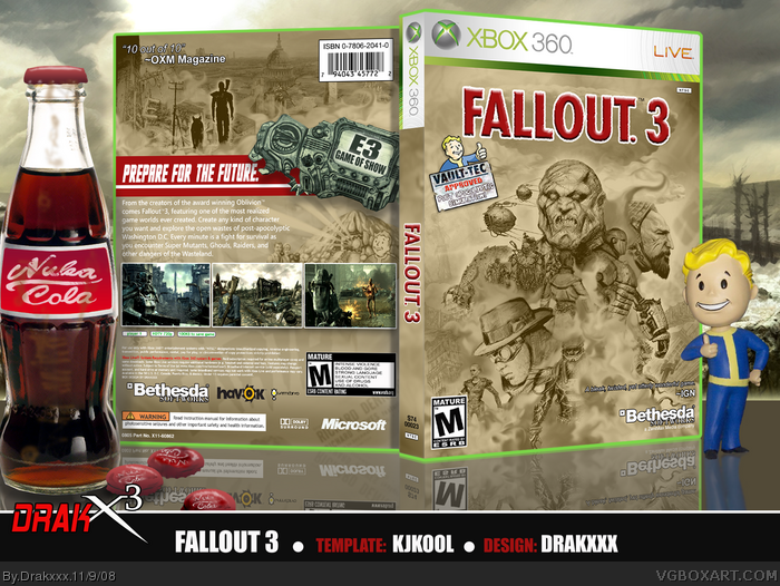
This is my uncustom Fallout 3 box. I pieced together the imagery from scans of the official concept art, which I rendered out, then edited via filters and contrasts. The dust clouds seen throughout is a single image of a cloud I put on different layers and worked around with the smudge tool.
Most of the Fallout 3 boxes I've seen have the same giant character on them, so my goal was to do something far away from that.
I had an idea for a "Mad Max" vibe going into this one, and I think the design has that happening for it.
I wanted to challenge myself to make a good design using existing art, rather than making whatever art I may need for my idea.
Let me know what you guys think of it, and as always Thanks!
Also: I made a printable available as well if anyone is interested.
#13, maybe I just want him to use real art for once? I'm not attacking him or saying that his art is bad, I'm just saying that it would be nice for at least once.
I hope you meant "official art" by that, because otherwise, that could be taken as a really ignorant post. And yes, he did use official art for this. Heck, whenever Joel draws his own art for boxes I see that as more "real" than using official art.
And really amazing job with this Joel, I've been a bit busy with a lot of things lately and wished I could have commented on the wip version of this on the group discussion board. Turned out great anyways! :D
I've been wanting to put together a box strictly in the graphic design sense for sometime, and a few boxes ago I believe I mentioned I had a Fallout 3 one in me. I The concept art illustrations in the art book were really dirty and gritty looking, much like the game, so I thought they would be kick ass for this design.
I know a lot of you guys appreciate my custom stuff, and that pleases me tremendously. That will always be my favorite method of doing things, but if the right official art comes along, that can be very inspiring as well.
#20 Hah, yes. Nuka Cola is the beverage of the post-apocalyptic future.
Amazing job, you really captured the Fallout vibe.
The break from your usual style is great, although I do slightly prefer your hand-drawn works. Clearly, you're awesome at both.
But like Marker said though, the logo is a bit garish in contrast to the color scheme, so maybe tone it down.
#26 Hah, thanks. I had 3 or 4 color schemes I thought looked pretty cool, and green was definitely a close 2nd because of the whole radioactive concept in the game.
I can't believe I missed this one. This is really well done, I could say that the screens on the back are abit badly organized and I don't like the borders but that would be so nitpicky you wouldn't believe it. Did you make that nuka-cola yourself?
EDIT: One small thing that might look good is you could, on the e3 game of the show bit, make it a green pipboy theme instead of white. Just a small suggestion :)
 Fallout 3 Box Cover Comments
Hey everyone,
This is my uncustom Fallout 3 box. I pieced together the imagery from scans of the official concept art, which I rendered out, then edited via filters and contrasts. The dust clouds seen throughout is a single image of a cloud I put on different layers and worked around with the smudge tool.
Most of the Fallout 3 boxes I've seen have the same giant character on them, so my goal was to do something far away from that.
I had an idea for a "Mad Max" vibe going into this one, and I think the design has that happening for it.
I wanted to challenge myself to make a good design using existing art, rather than making whatever art I may need for my idea.
Let me know what you guys think of it, and as always Thanks!
Also: I made a printable available as well if anyone is interested.
Edited at 1 decade ago
[ Reply ]
OMG I HAET U.
My Fallout 3 box I'm working on just go eaten.
[ Reply ]
Freaking awsome. I would add some blue color somewhere! Anyway, it looks amazing!
+ Fav
[ Reply ]
Yet the best box yet, I would love to see it have a bit more colour.
+ Fav
(HOF Worthy!)
[ Reply ]
All the images are so well blended, its amazing, great job!
[ Reply ]
Nice as always Drakx³
[ Reply ]
Nice, I like it +Fav
[ Reply ]
sweet jesus
[ Reply ]
Hell yeah!
[ Reply ]
If i could draw as good as you, i would brag my ass off! +Fav!
[ Reply ]
Dude...
[ Reply ]
You obviously have a talent in drawing, but I'd like to see you use real art.
[ Reply ]
#12, Ignorant, or just didn't read his first post?
"I wanted to challenge myself to make a good design using existing art, rather than making whatever art I may need for my idea."
Anyways Draxxx, wonderful work here, I'm glad to see that you didn't use that Brotherhood of Steel picture that appears on most F3 boxes. Great job ;)
[ Reply ]
Awesome!
[ Reply ]
#13, maybe I just want him to use real art for once? I'm not attacking him or saying that his art is bad, I'm just saying that it would be nice for at least once.
[ Reply ]
#15, Once again, you failed to read my post. He DID use real art.
[ Reply ]
#12, "real" art?
I hope you meant "official art" by that, because otherwise, that could be taken as a really ignorant post. And yes, he did use official art for this. Heck, whenever Joel draws his own art for boxes I see that as more "real" than using official art.
And really amazing job with this Joel, I've been a bit busy with a lot of things lately and wished I could have commented on the wip version of this on the group discussion board. Turned out great anyways! :D
[ Reply ]
Excellent work mate.. love the comic-style... excellent. Only thing I'm not keen on is the logo.. bit too stand-out. Top Marks!
[ Reply ]
A new approach to a Fallout 3 box. Great Job man!
[ Reply ]
does that say nuka cola on the bottle? lol.
as for the box, it's amazing. my personal favorite fallout 3 box on here. well done! :)
[ Reply ]
amazing and i'm drinking out of the same type of bottle, except coke cola
#20 that what they drink
Edited at 1 decade ago
[ Reply ]
Thank you everyone.
I've been wanting to put together a box strictly in the graphic design sense for sometime, and a few boxes ago I believe I mentioned I had a Fallout 3 one in me. I The concept art illustrations in the art book were really dirty and gritty looking, much like the game, so I thought they would be kick ass for this design.
I know a lot of you guys appreciate my custom stuff, and that pleases me tremendously. That will always be my favorite method of doing things, but if the right official art comes along, that can be very inspiring as well.
#20 Hah, yes. Nuka Cola is the beverage of the post-apocalyptic future.
[ Reply ]
"nuka cola is the beverage of the post-apocalyptic future."
that's terrible! lol.
[ Reply ]
Nice. Thanks for considering my recommendations. +fav
[ Reply ]
Amazing job, you really captured the Fallout vibe.
The break from your usual style is great, although I do slightly prefer your hand-drawn works. Clearly, you're awesome at both.
But like Marker said though, the logo is a bit garish in contrast to the color scheme, so maybe tone it down.
Edited at 1 decade ago
[ Reply ]
I love the Nuka Cola addition. Box is awesome, although I would've preferred a dark green color theme, but nonetheless, it looks great!
[ Reply ]
You continue to amaze me..
[ Reply ]
inspiring.=]
[ Reply ]
#26 Hah, thanks. I had 3 or 4 color schemes I thought looked pretty cool, and green was definitely a close 2nd because of the whole radioactive concept in the game.
thanks again everyone for your comments and favs.
[ Reply ]
I love this box, i printed a copy of it actually. and #23 It's the sensation that once hit the nation...ya know..before all the nuking.
Edited at 1 decade ago
[ Reply ]
I FUCKING HATE YOU! this is awesome!
[ Reply ]
I can't believe I missed this one. This is really well done, I could say that the screens on the back are abit badly organized and I don't like the borders but that would be so nitpicky you wouldn't believe it. Did you make that nuka-cola yourself?
EDIT: One small thing that might look good is you could, on the e3 game of the show bit, make it a green pipboy theme instead of white. Just a small suggestion :)
Edited at 1 decade ago
[ Reply ]