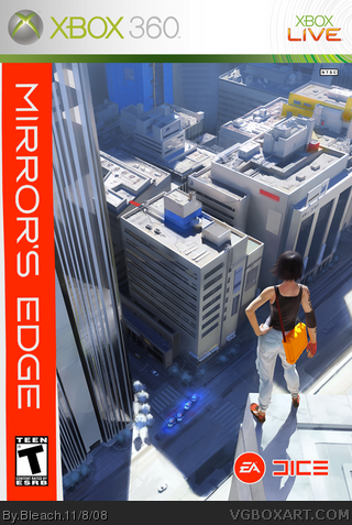
I like the side-bar with the name of the game and rating on it, but as for the actual box art, this is just a conceptual art on a template, isn't it? Please, tell me if I'm wrong.
i have to agree with #1, it just looks like art stuck on a temp. please correct me if im wrong as well, also i dont like how the ea and dice logo are right next to each other, usually the dice logo is in the middle, 2/5
 Mirror's Edge Box Cover Comments
I like the side-bar with the name of the game and rating on it, but as for the actual box art, this is just a conceptual art on a template, isn't it? Please, tell me if I'm wrong.
[ Reply ]
I'm not to sure about this. It's nice but I think it resembles something way too similar to an old videogame box, with the title down the side.
The rest that I say is what Ray Blade said.
overall 2/5. Could've been better, and the sideways logo hurts my head.
[ Reply ]
i have to agree with #1, it just looks like art stuck on a temp. please correct me if im wrong as well, also i dont like how the ea and dice logo are right next to each other, usually the dice logo is in the middle, 2/5
[ Reply ]