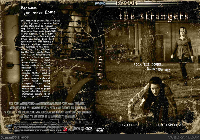
I think you've got the right feeling and mood with the way you did the box, I just think you should do something with the text. The extreme contrast of white on top of the browns and blacks of the pics you used makes it look really fake, and theres a little too much randomness with that grainy brown texture you put all over the place.
 the strangers Box Cover Comments
I can see that there was a lot of effort put into this but I really don't like it. Its just really boring.
[ Reply ]
#2 it's not really boring. i can see this is good. horror + classic.
[ Reply ]
The text is bad. Though the box looks pretty decent so far.
[ Reply ]
This guy has probably been stealing, but I need a trustworthy link.
It looks like it was stolen and up scaled in full size.
[ Reply ]
yeah 10/10 for effort i just dont wanna say anthing else
this movie is epic the and the box is and epic attempt
[ Reply ]
Oh HELL YES!
This movie scared the pants off of me.
[ Reply ]
I think you've got the right feeling and mood with the way you did the box, I just think you should do something with the text. The extreme contrast of white on top of the browns and blacks of the pics you used makes it look really fake, and theres a little too much randomness with that grainy brown texture you put all over the place.
Edited at 1 decade ago
[ Reply ]
my friends,instead saying its awful,share your covers in full size to use all of us!
[ Reply ]