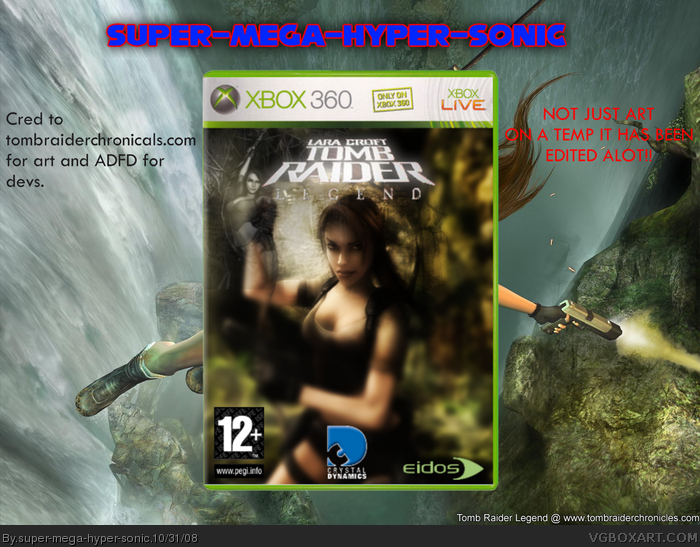
[ Box updated on October 31st, 2008 ] [ original ]
 Lara Croft Tomb Raider: Legend Box Cover Comments
Comment on super-mega-hyper-sonic's Lara Croft Tomb Raider: Legend Box Art / Cover.
[ Box updated on October 31st, 2008 ] [ original ]
Comment on super-mega-hyper-sonic's Lara Croft Tomb Raider: Legend Box Art / Cover.
I'm aiming for HOF!
W00T!
[ Reply ]
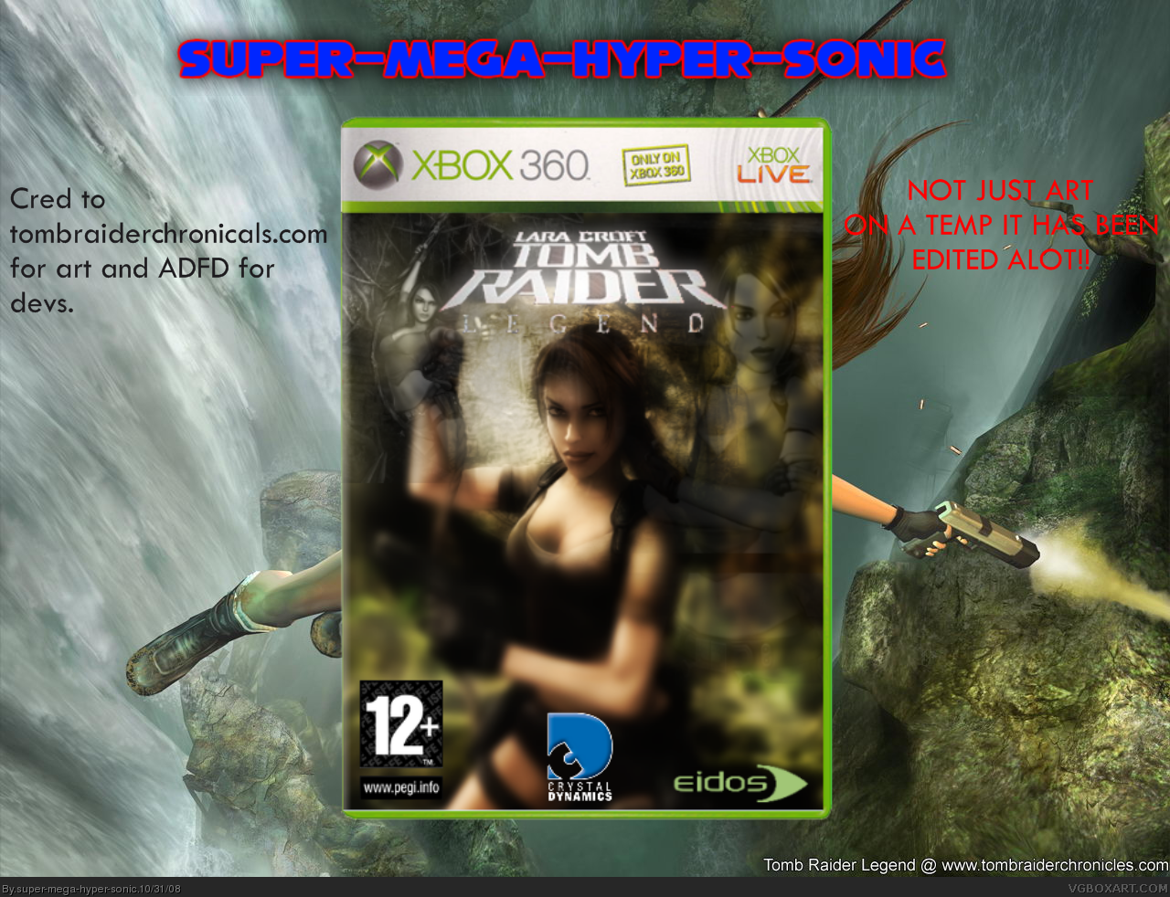
Quite nice. Im liking the effect of the blending but I think Lara is used too much. Did you blur it on purpose?, If you did, you should reduce it a little. The logo is a tad bit too small and choppy, the 'Legend' bit is not really clear either, same witn the crystal dynamics dev. Fix some things up and I will definetely fave. Doing a good job, try to make a back aswell, make evryone go wow! :P (hope I wasnt being too harsh)
Edited at 1 decade ago
[ Reply ]
#2, I'v sent a pm to roza for a better logo,yes it was blurred on purpose and the crystal dynamics logo was already cut out so i'll try and make it look better.Thanks.Update.
Edited at 1 decade ago
[ Reply ]
Yup, I agree with Blade, too much blur. Waaay too much extra space around your box. If you aren't going to have a back, don't use a whole wallpaper's worth of space. Also, I'd take out that bit about "Not just art on a temp" and so on. Anybody worth any fav they give you should be able to tell what kind of work went into a box.
This isn't bad, but it needs work.
[ Reply ]
if i make it less blurry i'd have to start the box again
i can't do anything right :(
[ Reply ]
#5, Don't be so hard on yourself. Just next time you do heavy image editing, save off periodically so you don't lose your progress and can't go back.
I only tell you a lot of stuff to improve it because I think you can do it, so chin up, k?
[ Reply ]