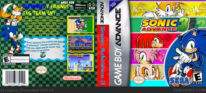
Really like the front. But try to find a better Sega logo. Don't forget it's licensed by Nintendo. =P
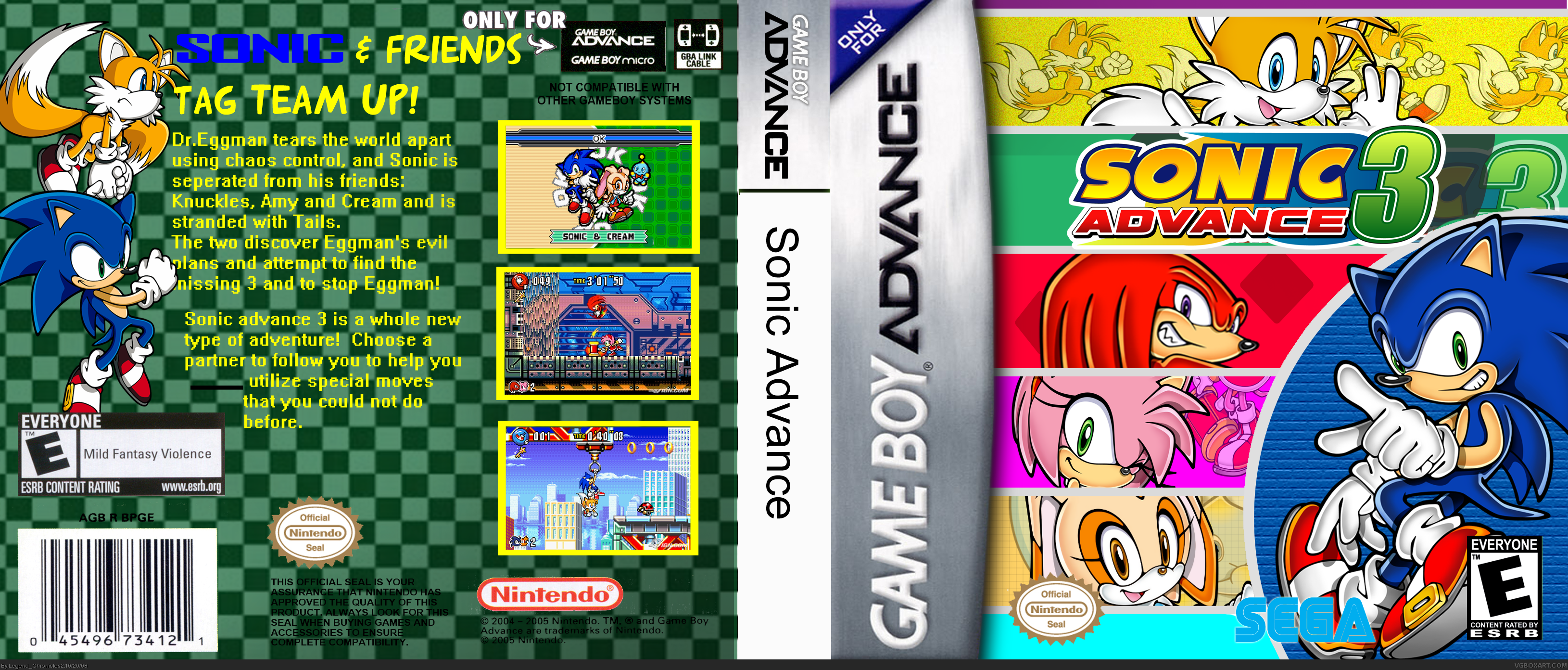
The back could use some work. i'd say: Try to look at the GBA boxes in the HoF, or just search some and try to look how they did it.
Allot of people say they don't like the backs of my boxes, though they never really tell me what they don't like. :(
The SEGA logo was actually written with a SEGA font. I could maybe just find a logo.
The...front...is...AMAZING. Although Im not too sure why you have the logo on there twice. The sega logo is the old one, so try to find that dark blue one rtaher than this sky blue one. The back could use some work. And the spine... make it more colorful, and cut it out better? Please fix this, it's a shame to not fav such a wonderful front, IMO.
Well, the borders of the images are too big. The most important thing is the background, it's the same pattern again and again. The text is also a bit boring, try to use some special effects or try to make it a bit more spectaculair.
 Sonic Advance 3 Box Cover Comments
Hi :) Comment and rate please.
Credit goes to Rokudaime for the template.
Update: Gave it a better logo and a more interesting spine but I don't know what you make by "could use some work"
Edited at 1 decade ago
[ Reply ]
Really like the front. But try to find a better Sega logo. Don't forget it's licensed by Nintendo. =P
The back could use some work. i'd say: Try to look at the GBA boxes in the HoF, or just search some and try to look how they did it.
[ Reply ]
Allot of people say they don't like the backs of my boxes, though they never really tell me what they don't like. :(
The SEGA logo was actually written with a SEGA font. I could maybe just find a logo.
thanks :)
[ Reply ]
The...front...is...AMAZING. Although Im not too sure why you have the logo on there twice. The sega logo is the old one, so try to find that dark blue one rtaher than this sky blue one. The back could use some work. And the spine... make it more colorful, and cut it out better? Please fix this, it's a shame to not fav such a wonderful front, IMO.
[ Reply ]
The front is awesome, the back needs some work.
[ Reply ]
Nice, Cheerful, I like it :) Though the back could use some work.
[ Reply ]
Well, the borders of the images are too big. The most important thing is the background, it's the same pattern again and again. The text is also a bit boring, try to use some special effects or try to make it a bit more spectaculair.
[ Reply ]
Well, I give it a 3.75/5.
The design is pretty nice. The back font is bland, and for the tagline, I would use Sonic's logo font for his name, maybe that's just me.
I also don't know about the double logo you have going on on the front, but I'll excuse that.
Fun Fact: THQ published Sonic Advance 3, at least in the US.
I'm going to fav, because the rest of the layout is pretty sweet.
[ Reply ]
Thanks everybody.
I'm sure sure if I've made the box worse by adding the blue box but it'll do for now.
[ Reply ]
#9, Naw, just make it smaller, and add a drop shadow to this text on the back (a much more appealing font)
Actually, I like the blue area, reminds me of the game because of all those annoying mecha Chao.
[ Reply ]
Better. The front's amazing, so Im faving. :D
[ Reply ]
Your best by far. The front looks fantastic!
[ Reply ]
Thanks for the favs.
I've just noticed the verbal error I've made in post #9 lol
Ah well, it was very late at night.
[ Reply ]
#13, And I never noticed it.
[ Reply ]
why is a GBA game in a 360 file. but the box is good
[ Reply ]
#15, Oh God I never noticed :O
n00bie mistake.
And thanks.
[ Reply ]