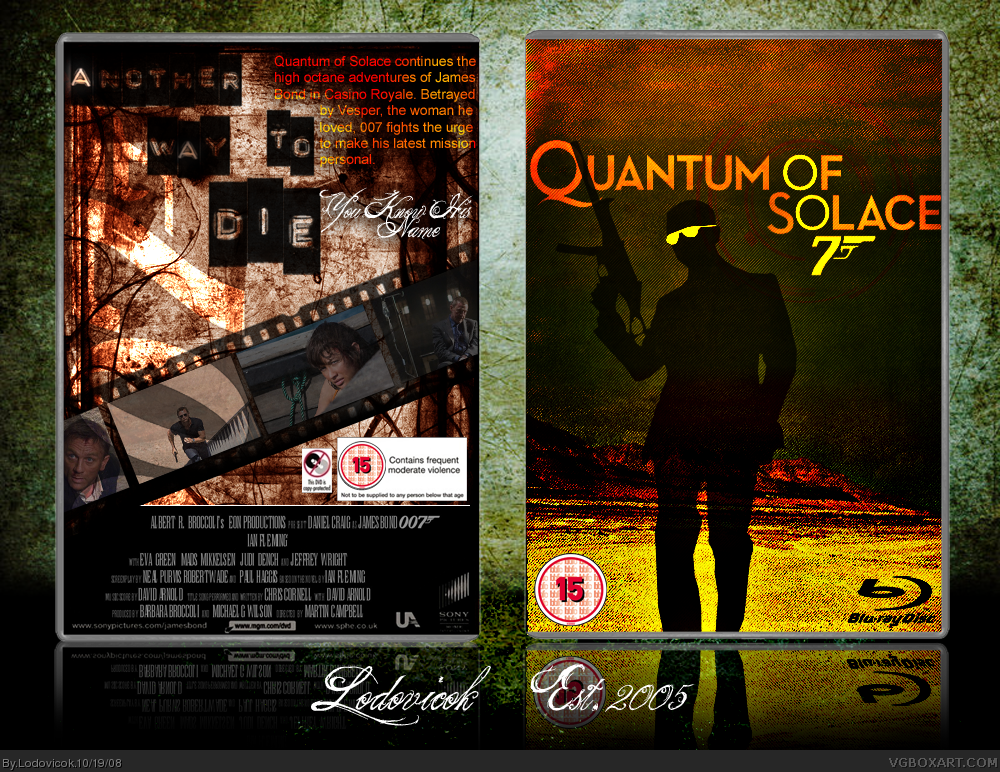
Front concept is nice, just tone down the contrast.
The back needs to be completely revamped though, really doesn't fit the style.
Good attempt, we'll see great things from you soon.
Hey Lodo good to have you back on this site...welcome back!
This is a nice box, I love the front however I'm not to keen about the back (it's a little bit plain!).
SWEET JESUS ON A WAFFLE CONE!!!
YOU'RE BACK!
:D
Kinda funny you came back like, the day after i did. :P
....are you stalking me? >_>
Anywho,
I really love the front, it's extremely creative.
The back, to me, seems a little bit empty though, mainly around the screenshots. Maybe a different way of presenting those screens might look neat.
Overall i really like it though.
I really love thre front :D i think its very creative and looks visually appealing :D but i dislike the back :( like Elcrazy said..a bit bland :D nice job altogether glad to see your back ;)
#17, hahah, yah you better have. :P
kiddin'
But i've been pretty good. If you get on aim later i'll talk to you through there.
Cause the moderators are watching....always watching.... O___o
or just private message, haha
Oh my... Lodovicok is back... what next? Syrneus is going to make a post.
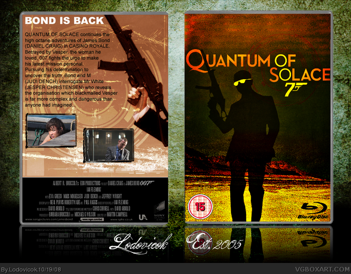
Nice one, the yellow glasses are too cheesy. I would have left the whole silhouette black. Not one of your best but then again you haven't been online for about a year. What's wrong with the update button?
#20, Thanks mate. Yah, I know it's not great compared to others of mine...but I'm going to try to improve and meet the site's standards (you guys have really raised the bar in the last year)....yah, the update button is sketchy, sometimes it uploads and sometime it "fails to open page"...
Anyways, I'm glad to be back finally. Hopefully you'll see more from me soon!
Great, a veteran is back. Lodo, you may not know me, as I joined in March this year, but I totally admire your work, and things were looking slim for you to return. Really nice box, I don't actually see any obvious flaws whatsover. Fav+
All we need is WG1 and probably Mist to return, but Mist came back, (remember guys?!1?!) and never came back a couple days later to post his box like he promised...
 Quantum Of Solace Box Cover Comments
Well, that's different.
[ Reply ]
Well, it's been a year...
[ Reply ]
text on back is slightly hard to readbut it is nice, good one man
[ Reply ]
Wow. Just WOW.
[ Reply ]
Everyone's back! Now all we need Mist & WG1...
Front concept is nice, just tone down the contrast.
The back needs to be completely revamped though, really doesn't fit the style.
Good attempt, we'll see great things from you soon.
[ Reply ]
YOU'RE BACK!
[ Reply ]
Currently revamping back...
[ Reply ]
The return of a veteran. Welcome back Lodo its good to see you back here again.
[ Reply ]
nice job! fav now but where is the age rating on the back?
Edited at 1 decade ago
[ Reply ]
The back actually looks pretty bland now =S
[ Reply ]
YES another vet back
now all we need is Mist, WG1and VGM back
[ Reply ]
Hey Lodo good to have you back on this site...welcome back!
This is a nice box, I love the front however I'm not to keen about the back (it's a little bit plain!).
[ Reply ]
the update thingy isn't working
[ Reply ]
#13,the image may be the wrong size or format, make it at least 700 pixels wide and in a png. format
[ Reply ]
thanks
Edited at 1 decade ago
[ Reply ]
SWEET JESUS ON A WAFFLE CONE!!!
YOU'RE BACK!
:D
Kinda funny you came back like, the day after i did. :P
....are you stalking me? >_>
Anywho,
I really love the front, it's extremely creative.
The back, to me, seems a little bit empty though, mainly around the screenshots. Maybe a different way of presenting those screens might look neat.
Overall i really like it though.
[ Reply ]
#16, lol, i've missed your hilarious comments :p How are you?
[ Reply ]
I really love thre front :D i think its very creative and looks visually appealing :D but i dislike the back :( like Elcrazy said..a bit bland :D nice job altogether glad to see your back ;)
[ Reply ]
#17, hahah, yah you better have. :P
kiddin'
But i've been pretty good. If you get on aim later i'll talk to you through there.
Cause the moderators are watching....always watching.... O___o
or just private message, haha
[ Reply ]
Oh my... Lodovicok is back... what next? Syrneus is going to make a post.
Nice one, the yellow glasses are too cheesy. I would have left the whole silhouette black. Not one of your best but then again you haven't been online for about a year. What's wrong with the update button?
[ Reply ]
#20, Thanks mate. Yah, I know it's not great compared to others of mine...but I'm going to try to improve and meet the site's standards (you guys have really raised the bar in the last year)....yah, the update button is sketchy, sometimes it uploads and sometime it "fails to open page"...
Anyways, I'm glad to be back finally. Hopefully you'll see more from me soon!
[ Reply ]
Just letting you know that Version 2 is my favorite.
[ Reply ]
#22, rofl...yah, I don't know what happened there, I uploaded it and it turned out like that :s ... it does look cool though... psychedelic static
[ Reply ]
You're back!
[ Reply ]
nice one lodo, glad to see you back!
[ Reply ]
*Bows in unworthyness to a vet* Come on Lodo, hook us up with some great new boxes :-p
[ Reply ]
I agree with what everyone else said, and welcome back Lodo!
[ Reply ]
One my favorite artist is back. Wecolme back 5/5 fav+.
[ Reply ]
Welcome back!! :D
[ Reply ]
OH GOD *breathes heavily* I admire your work +fav
[ Reply ]
Edited at 1 decade ago
[ Reply ]
Great, a veteran is back. Lodo, you may not know me, as I joined in March this year, but I totally admire your work, and things were looking slim for you to return. Really nice box, I don't actually see any obvious flaws whatsover. Fav+
All we need is WG1 and probably Mist to return, but Mist came back, (remember guys?!1?!) and never came back a couple days later to post his box like he promised...
[ Reply ]
#32, Nice to meet you, thanks for the fav mate
[ Reply ]
Not bad, but doesnt really have the bond feeling.
[ Reply ]
#34, lol, yah, well neither will the film probably :p... thanks for looking anyways
[ Reply ]
You know I like the front but the back is seriously lacking.
[ Reply ]
Back text is plain. Front looks a bit like a screenshot from a Kanyw West Video. But oddly it fits the new generation Bond movie theme.
[ Reply ]
the front looks like a splinter cell cover and the back IMO is terrible the pics screenshots look out of place and the font is basic.2/5
[ Reply ]
Every1 is so critical because they all are amazing HOW DO U DO IT?!
[ Reply ]