I not so bad but I think the font is too plain and boring and its kinda weird that a DS game goes too the WII, but it looks good and Ill give you a 3.7/5
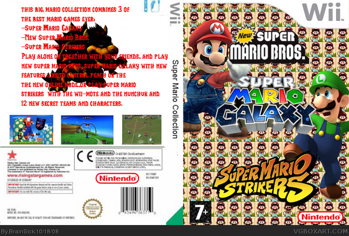
-backround on front is messed up
-no backround on back
-text illegible on back
-back is really really bad
-text on the spine (USE A LOGO!)
-No actual logo for the box itself
-wii template is messed up
#2, I don't mind the no logo on the spine, since many games do that, though admittedly not as much Wii games by FAR.
I think you could find some good renders or wallpapers or such to edit into decent backgrounds for the front and back. I'm not diggin' the millions of 16 bit Marios on the front, because there are no old school Mario games included. Take a look at official Gamecube and Wii boxes for inspiration.
I don't know if you'll listen, or if you care, but I've tried.
 Super Mario Collection Box Cover Comments
I not so bad but I think the font is too plain and boring and its kinda weird that a DS game goes too the WII, but it looks good and Ill give you a 3.7/5
[ Reply ]
-backround on front is messed up
-no backround on back
-text illegible on back
-back is really really bad
-text on the spine (USE A LOGO!)
-No actual logo for the box itself
-wii template is messed up
1/10
[ Reply ]
#2, I don't mind the no logo on the spine, since many games do that, though admittedly not as much Wii games by FAR.
I think you could find some good renders or wallpapers or such to edit into decent backgrounds for the front and back. I'm not diggin' the millions of 16 bit Marios on the front, because there are no old school Mario games included. Take a look at official Gamecube and Wii boxes for inspiration.
I don't know if you'll listen, or if you care, but I've tried.
[ Reply ]
#2, agree. the only thing i find cool are the logos.1/5
[ Reply ]
#2, i agree more than i hate your boxs and commets
[ Reply ]