Don't know how to feel about that grainy Background image, but it definitely makes the characters the point of focus. Nice wallpaper in behind the box (it is a wallpaper, right?) I was serious though, it's muted color helps focus on the box. Atogether, pretty good. Was the lens flare on the bat originally? I think that's hilariously awesome.
I really like your boxes.. but i think you allways use ethe same "effect" in your Boxes..
The Nintendo Logo its a little bit to big..
nonetheless its a good Box:)
i didn't see your post #12. lol. i didn't want it to be green because it makes the characters stand out more with less color, so i changed it. and thanks to all for the favs and comments!
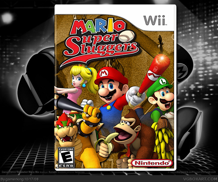
 Mario Super Sluggers Box Cover Comments
sorry about two boxes in one day, but i really wanted to put this in and get some comments. :P lol. credit to adfd for temp.
i tried a sort of different approach to this game than the other boxes for it on this website, so i hope you like and let me know what you think!! :)
[ Reply ]
It looks nice! :)
[ Reply ]
*Double Post My Bad*
Edited at 1 decade ago
[ Reply ]
nice double post. lol.
[ Reply ]
Don't know how to feel about that grainy Background image, but it definitely makes the characters the point of focus. Nice wallpaper in behind the box (it is a wallpaper, right?) I was serious though, it's muted color helps focus on the box. Atogether, pretty good. Was the lens flare on the bat originally? I think that's hilariously awesome.
[ Reply ]
nah, i made the glare. :) thank for the comment and fav!
___________________________________________-
thanks!
Edited at 1 decade ago
[ Reply ]
#6, All the better. Lens flare is so cheesy, but it works so nice there.
[ Reply ]
This is one of the better Mario Super Slugers boxes I've seen, good job. The Nintendo logo and the ESRB need to be fixed though, they are stretched.
Edited at 1 decade ago
[ Reply ]
i know. i seem to have trouble with the esrb for some reason. lol. but thank you very much for the fav!
[ Reply ]
nice joe!
[ Reply ]
haha. thanks ryan. lol. and yes! i got some more favs!! keep 'em comin!! lol.
[ Reply ]
well, i like it. i just don't like that gold background on the box, maybe change it to green? it would have a much better Mario feel to it
nonetheless, good box. i'll fav, your improving :)
[ Reply ]
I really like your boxes.. but i think you allways use ethe same "effect" in your Boxes..
The Nintendo Logo its a little bit to big..
nonetheless its a good Box:)
Edited at 1 decade ago
[ Reply ]
okay, thanks. but what do you mean by "effect"?
[ Reply ]
i didn't see your post #12. lol. i didn't want it to be green because it makes the characters stand out more with less color, so i changed it. and thanks to all for the favs and comments!
[ Reply ]
Wow gamerking, you sure have been impressing me with some of your recent boxes! Keep up the good work.
[ Reply ]
thank you!!
[ Reply ]
Good, but the background doesn't give a baseball feel.
[ Reply ]
thanks, but i didn't know what to do for the background. i guess i can get a baseball stadium off google and put that as the background. lol.
[ Reply ]
thanks for the fav zerobober!!
[ Reply ]