![]() »
»
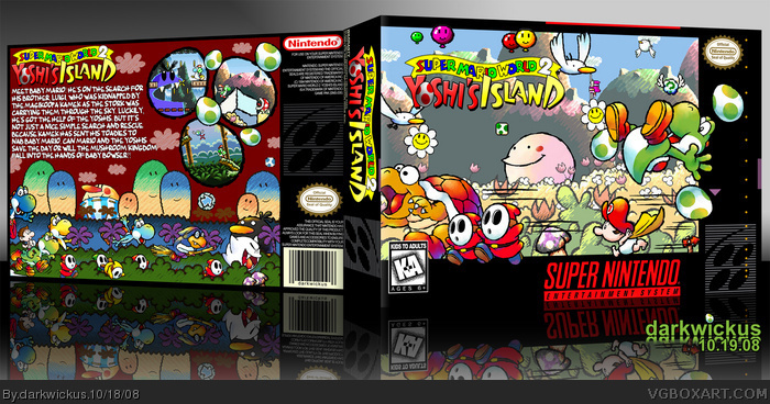
[ Box updated on October 19th, 2008 ] [ original ]
 Super Mario World 2: Yoshi's Island Box Cover Comments
Comment on darkwickus's Super Mario World 2: Yoshi's Island Box Art / Cover.
![]() »
»
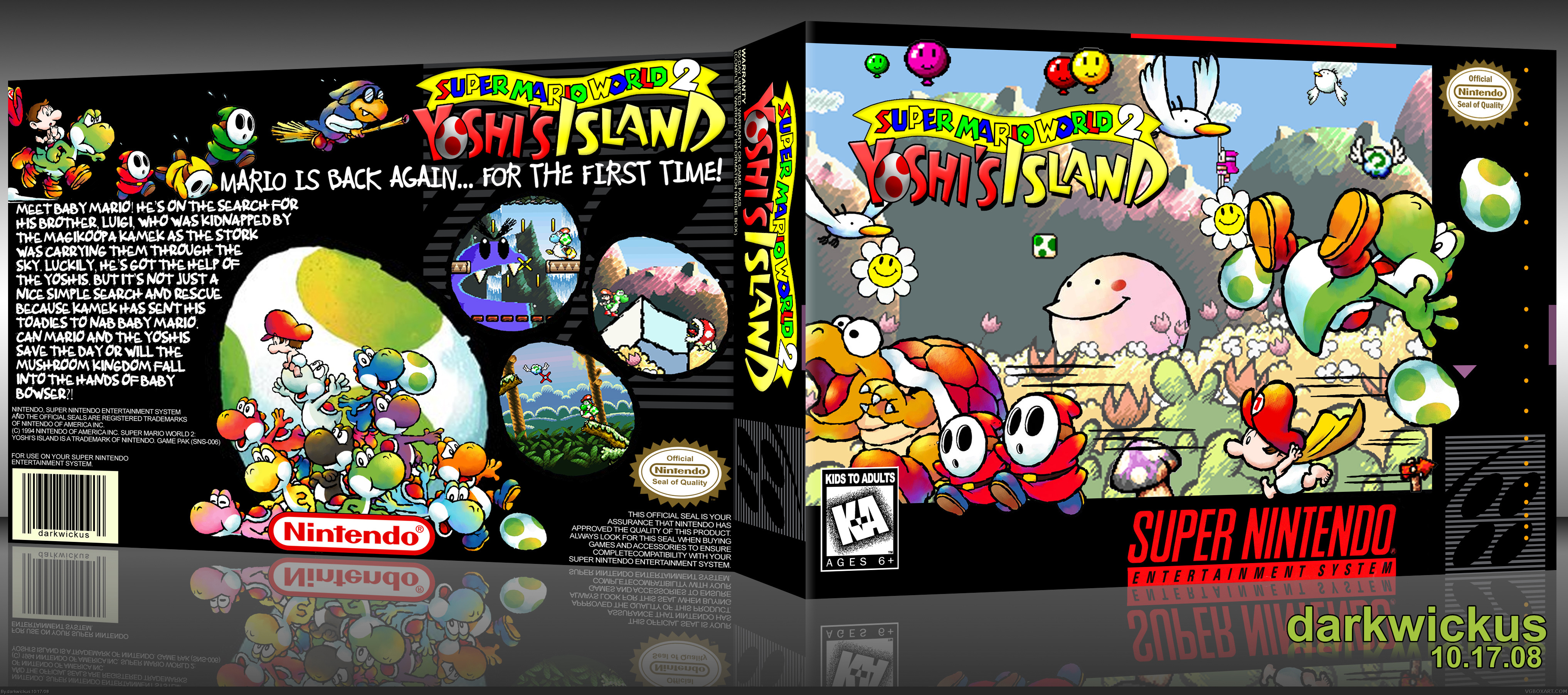
[ Box updated on October 19th, 2008 ] [ original ]
Comment on darkwickus's Super Mario World 2: Yoshi's Island Box Art / Cover.
So, yeah, another SNES box. Deal.
As I was looking back at my last couple of boxes (and you should be right now too, muwahahaha!) I noticed they are pretty dark. This is my answer to offset that a bit. Nothing like flowers and smileys and crayons to brighten things up! For some reason, I left this at full resolution, so enjoy!
[ Reply ]
Well, you finally got the front to look like an actual part of the game, and not like a bunch of renders on a template, so that's good. But, I still don't like the back. Maybe it's the SNES template, but it just feels lacking. Also, I don't really like the eggs for the screen borders. You can't see enough of the screenshot. The front's awesome, but the back feels lacking, in my opinion.
[ Reply ]
honestly, this is amazing
[ Reply ]
Agree with #3 amazing is the only word I can use!
[ Reply ]
What's next?
[ Reply ]
One of my favorite games, especially when I was younger. The art style blew me away at the time. The egg on the back is not very well cut out and the back's arrangement has things too close together. Otherwise very nice. I will like to see an update.
[ Reply ]
One of my favorite SNES games! The front is good, but I think the back needs to be more colorful. ;)
[ Reply ]
i freakin lovve this box
i like wat you did with the screen shots
[ Reply ]
=D I love the back
[ Reply ]
The game was awesome, and so is this box.
[ Reply ]
I personally like the egg screenshots. The big egg looks weird since you cant see that it has a sketchy stroke around it. I would try and find a regular Yoshi egg or edit that one to get rid of the stroke. I love all the Yoshis under Baby Mario render. The front is flat out amazing and it is PERFECT!
[ Reply ]
I love all the activity on this one!
[ Reply ]
Thanks for all the feedback guys! I agree that the back is a bit... lacking. I have been playing around with a few ideas in my head, and when I get some free time, you'll probably see a v2 with a revised back and a few minor fixes. Until then! =)
[ Reply ]
So awesome! I love this game; the box fits it's style perfectly and at the same time it's original. Nice job.
Edited at 1 decade ago
[ Reply ]
I like that pink guy in the background on the front.
Edited at 1 decade ago
[ Reply ]
#15, lmao he looks cool
[ Reply ]
Update! Due to some feedback, I made some changes here. Most notably is the back design, as I completely redid it. I wanted to have the same energy and feel as the front. I think this new design reflects that. Also, I changed some perspective issues with the back as well as cleaned up a few images on the front. The resolution is also decreased a bit to be a more enjoyable view. All in all, I think this is a much better presentation. Enjoy!
#15: That's Marching Milde. Represent! lol
[ Reply ]
And here I didn't think this could get any better. That new back just makes it that much more awesome. Great work darkwickus!
[ Reply ]
Hail to the chief!
[ Reply ]
Awesomeness.
[ Reply ]
wow.
[ Reply ]
I'm a sucker for SNES games. This just looks gorgeous!
[ Reply ]