[ Box updated on October 14th, 2008 ] [ original ]
 Sonic Mega Collection Plus Box Cover Comments
Comment on Legend_Chronicles2's Sonic Mega Collection Plus Box Art / Cover.
[ Box updated on October 14th, 2008 ] [ original ]
Comment on Legend_Chronicles2's Sonic Mega Collection Plus Box Art / Cover.
AllDreamsFallDown definitely made this template. So, credit to you.
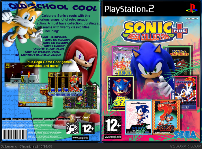
This box took me a bit of a while. I always have a feeling that I'm missing something or I've did something wrong when I submit a box. Here it is anyway.This is my first box that doesn't have a girl on the front lol
[ Reply ]
front good back bad.
3.9/5
[ Reply ]
The front looks great but the back looks a bit weird.
[ Reply ]
great
[ Reply ]
#3 How so?
#4 thanks
[ Reply ]
#5, The text is hard to read to to being half-paster onto Knuckles. You should add a border or a different Knuckles render.
[ Reply ]
The back does have some text and layout issues but im totally loving the design of the front! Very creative and it looks brilliant! The only problem is you used PAL box covers for the Megadrive games but American ESRB logos for the age rating. Swap the ESRB with PEGI and I will fav it.
[ Reply ]
#6 Oh OK
#7 Thanks. I had to change Flickies Island to Blast. :)
[ Reply ]
I like the front a lot, it's stylishly done, and lets me know I'm getting a lot of games with this package.
I don't like how the bottom of Sonic is blended though, and I'm think it would look better if you just dropped him behind the appropriate layers.
The main problem I'm having with the back is the text. The layout is actually pretty good. As it is now, the text is a little boring and just there. maybe experiment with some different fonts, and put them on diffrent angles, and change point sizes.
Oh, also, what #7 says. Change the rating to the PEGI, as you've used all the Megadrive covers.
[ Reply ]