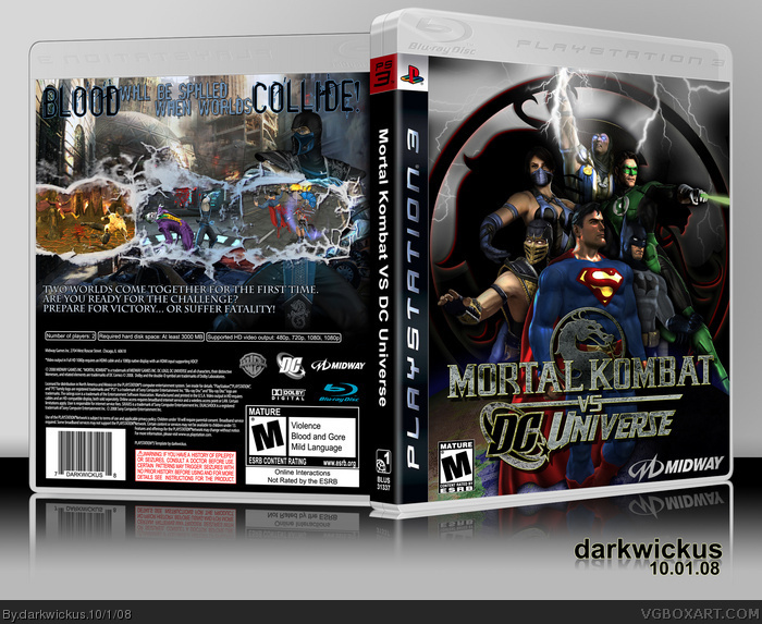
Another PS3 boxart from darkwickus?! Say it ain't so!
Well, it's so. Credit goes to Sens again for the great casing. Template by me! So, the same care and attention my retro boxes get has also gone here... I couldn't find a great enough logo for the front, so I made one. I also tried to give the in-game character renders on the front a more polished feel. And the back was just pure fun to make. With all the ice and destruction going on, I tried to keep the back as simple as possible.
As always, your words of encouragement and critique are welcome! Enjoy in full!
I personally think this game is a terrible idea, but the box is great. That logo is really good too, I wouldn't even have know it wasn't official if you hadn't said so.
#3: Yah, I'm pretty sure this game will not be on my list of games to purchase. I liked the original Mortal Kombat, and I love Superman & Batman, so I'm glad I had the opportunity to kill two birds with one stone.
And as for the logo, it's as official as I could make it. What I normally do in a situation where I can't find a large enough logo is to scale a smaller one up to size, then start re-creating the elements on top of it until I have them all and can delete the original layer. It's most noticable in the "vs" part, since I didn't have that same font. -__-;
this is an epic front the logo is f*ucking awesome just need more brightness on the front and maybe a better background image on the back... but thats just a matter opinion
nah, that isn't a wallpaper. if it was then i would have seen it on google when i was looking for my own pics. this box still amazes me though. the front is just awesome. the back..not AS much, but it doesn't matter. the front is awesome enough for both sides.
This is the image I used for Superman. If you go to the worldscollide website, you'll see the other images I used for the characters as well. Each one took quite a while to cut out, and I also did some editing to give them more "depth".
 Mortal Kombat vs. DC Universe Box Cover Comments
The front really gets me :D Nice Job!!!
[ Reply ]
Another PS3 boxart from darkwickus?! Say it ain't so!
Well, it's so. Credit goes to Sens again for the great casing. Template by me! So, the same care and attention my retro boxes get has also gone here... I couldn't find a great enough logo for the front, so I made one. I also tried to give the in-game character renders on the front a more polished feel. And the back was just pure fun to make. With all the ice and destruction going on, I tried to keep the back as simple as possible.
As always, your words of encouragement and critique are welcome! Enjoy in full!
[ Reply ]
I personally think this game is a terrible idea, but the box is great. That logo is really good too, I wouldn't even have know it wasn't official if you hadn't said so.
[ Reply ]
#3: Yah, I'm pretty sure this game will not be on my list of games to purchase. I liked the original Mortal Kombat, and I love Superman & Batman, so I'm glad I had the opportunity to kill two birds with one stone.
And as for the logo, it's as official as I could make it. What I normally do in a situation where I can't find a large enough logo is to scale a smaller one up to size, then start re-creating the elements on top of it until I have them all and can delete the original layer. It's most noticable in the "vs" part, since I didn't have that same font. -__-;
Glad ya like it!
[ Reply ]
Great job sir as always.
[ Reply ]
this is an epic front the logo is f*ucking awesome just need more brightness on the front and maybe a better background image on the back... but thats just a matter opinion
+fav
[ Reply ]
This is very nice =]
well done
[ Reply ]
I love it.
[ Reply ]
This blows mine out of the water.
[ Reply ]
DUDE! I'm completely blown away! This turned out amazing. Great job!
[ Reply ]
awesome job! 5/5 +fav
[ Reply ]
fav! but marvel is the best!
[ Reply ]
Great job dude :D awsome as usual
[ Reply ]
great job, even though I hate the game
fav anyway :)
[ Reply ]
same with #9. this pretty much destroys mine. lol. fav
[ Reply ]
Not trying to destroy anything here! LOL! It's just a different take than the other submissions.
Thanks for all the positive support everyone! I just came back from the dentist (AHHHHHHHHHHHHHHHHH!) and so I have something to smile about! ^__^
[ Reply ]
this is great.
but is the front just a wallpaper? if not i dont care
its clean its beautiful, and i love it.
favvvvvv
[ Reply ]
nah, that isn't a wallpaper. if it was then i would have seen it on google when i was looking for my own pics. this box still amazes me though. the front is just awesome. the back..not AS much, but it doesn't matter. the front is awesome enough for both sides.
[ Reply ]
#17: Definitely not a wallpaper, sir. Not my style.
link
This is the image I used for Superman. If you go to the worldscollide website, you'll see the other images I used for the characters as well. Each one took quite a while to cut out, and I also did some editing to give them more "depth".
[ Reply ]
I don't know if I can say anything about this except AWESOME! I love the logo and the whole front comp. Back looks very nice as well.
FAV!
btw, the screenshot borders are pretty sweet as well! ^_^
Edited at 1 decade ago
[ Reply ]
You are a GOD! FAV!
[ Reply ]
*loves it*
[ Reply ]
i even updated mine and made it better, but this still kills it. lol. why isn't this in the hall yet?
[ Reply ]
yay!! hall of fame!! woo!
[ Reply ]
Not bad but its not really fair that superman stands out more than mortal kombat. It should be equal.
[ Reply ]
nice job
[ Reply ]