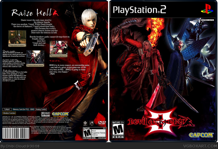
I present to you: My Devil May Cry 3 box art. A game that I was in love with. Literally. Credit goes to alldreamsfalldown for the template. ;) Enjoy! I hope this isn't a bad time to upload apparently hehe... ^^; Don't know if it will compare to Vengeance's ha ha...
EDIT: I am willing to update this box art with any criticism I get. :D
The front is really good. But the back isn't every thing seems sorta out of place. Also you should make the white bits around the box bigger like some of my boxes or just get rid of it, at the moment it looks dodgey.
I love the ideas on that box, front is really great (although renders are a little bit choppy) and the back would've been awesome if the screenshots were larger and you positioned them differently.
 Devil May Cry 3 Box Cover Comments
I present to you: My Devil May Cry 3 box art. A game that I was in love with. Literally. Credit goes to alldreamsfalldown for the template. ;) Enjoy! I hope this isn't a bad time to upload apparently hehe... ^^; Don't know if it will compare to Vengeance's ha ha...
EDIT: I am willing to update this box art with any criticism I get. :D
Edited at 1 decade ago
[ Reply ]
The front is good but i dont like the back that much.. the info on the back and the screenshots are pretty small but i still like the box.. 4/5
[ Reply ]
#2, yeah, stupid ImageShack wouldn't stop resizing my box...
[ Reply ]
The front is really good. But the back isn't every thing seems sorta out of place. Also you should make the white bits around the box bigger like some of my boxes or just get rid of it, at the moment it looks dodgey.
[ Reply ]
I love the ideas on that box, front is really great (although renders are a little bit choppy) and the back would've been awesome if the screenshots were larger and you positioned them differently.
[ Reply ]
Move the logo up and i will fav this 4/5.
[ Reply ]
Me Like :)
[ Reply ]
its great but i dont like the empty space on the back and the text is boring for a DMC game
[ Reply ]
O_O awesome!
[ Reply ]
This box es muy sexy =P
[ Reply ]
This box is tight, this is what it should've been when it camed out
[ Reply ]
love the contrast between red and blue (without being patriotic XD) +fav
[ Reply ]