Wooooooooooooooooo. Finally done. I think it came out well. I worked on this yesterday at 9:00pm to 12:00pm today. Credit to Sp-6 for the shine on the box.
This is amazing. The only thing is that there is two different logos on the front and the side. I don't know if its supposed to be like that or not. +fav
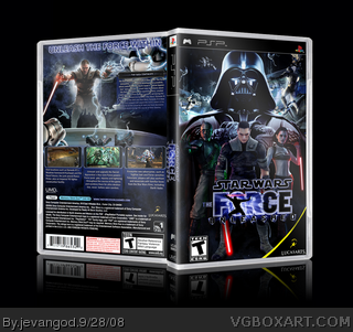
I don't like it really, it looks like you used screen shot renders for the people on the front, which looks really bad imo.
Then on the back, the render of the Apprentice doesn't look great, the fact that the lower part of him goes to blue looks wierd, same goes for the storm trooper next to his leg.
Plus this is nothing we haven't seen before.
#16, Well they sure look like screen renders.
And I realize it's a good cut, he did a great job and all but it doesn't look too good when you're using a render with the effects still there on a boxart.
 Star Wars: The Forced Unleashed Box Cover Comments
Wooooooooooooooooo. Finally done. I think it came out well. I worked on this yesterday at 9:00pm to 12:00pm today. Credit to Sp-6 for the shine on the box.
Hope yall like!
View Printable too its nice!
Printable added
Edited at 1 decade ago
[ Reply ]
wow.
[ Reply ]
This is mighty sexy. "The Forced"?
[ Reply ]
Looks Great!
[ Reply ]
#3, Ohh sorry Ill tell E_G to fix it.
[ Reply ]
very cool
[ Reply ]
Way to use SC4 material for The Apprentice. lol jk.
Nice. 5/5 Fav
[ Reply ]
O.O
Wow...
Edited at 1 decade ago
[ Reply ]
This is ingenious!
[ Reply ]
well done, looks really great.
i like it:)
[ Reply ]
This is amazing. The only thing is that there is two different logos on the front and the side. I don't know if its supposed to be like that or not. +fav
Edited at 1 decade ago
[ Reply ]
#11, No their both the same logo its just the shine makes it look different. The angle too.
[ Reply ]
I meant how there's someone in the "o" in Force.
[ Reply ]
#13, Ohh yea I had two different logos. I never noticed that. Good eye.
[ Reply ]
I don't like it really, it looks like you used screen shot renders for the people on the front, which looks really bad imo.
Then on the back, the render of the Apprentice doesn't look great, the fact that the lower part of him goes to blue looks wierd, same goes for the storm trooper next to his leg.
Plus this is nothing we haven't seen before.
[ Reply ]
#15, No their not screen shot rennders and the render is from planet renders and its a very good cut.
[ Reply ]
Wow, I'd say it's my fav FU box on the site. Great use of the SCIV render ;)
[ Reply ]
#16, Well they sure look like screen renders.
And I realize it's a good cut, he did a great job and all but it doesn't look too good when you're using a render with the effects still there on a boxart.
[ Reply ]
#5, I can't rename it. I disagree with DS11, I like the box, still saying that the text underneath the tag line is extremely small.
[ Reply ]
On the back, for the website URL you also put "forceDunleashed" on there.
[ Reply ]
#20, I know it was really early. I had just woke up and wasnt thinking straight.
[ Reply ]
Sweet box but your glow is epicly bright haha.
[ Reply ]
#22, Thanks Ill lower the glow brightness next time, lol
[ Reply ]
great job.
[ Reply ]
Didn't you say you were stopping boxart making?
[ Reply ]
#25, Yea but I was mad at the moment (as usual) I love this site too much to stop.
[ Reply ]
Congrats. My fav got it into the Hall hehe!
[ Reply ]
#26, oh. Well its good to know that you're here to say!
[ Reply ]
i wanna play that game so bad looks good and nice box =)
[ Reply ]
awesome box you rulez
[ Reply ]