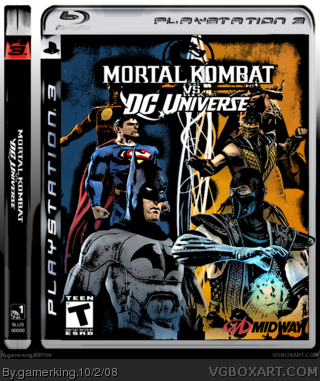
You've got decent resolution on the characters and art. However, some characters look stretched, and others look squashed. Batman looks stretched, Superman looks squashed to fit him under the logo. After you unstretch Batman, you can move him down a tad to give Superman a little more room. However, Flash wasn't so lucky. I would go ahead and move him to the left some since the template already cuts off his arm some.
For the background, I would add some texture to break up all that blank space. Also I would put a outer glow on the Mortal Kombat dragon.
#3, Then somebody else stretched him, lol. He looks kinda long. (Honestly, I can't stand what Midway did with his costume anyway...looks too patchwork.)
If you decide to revisit it, maybe add a back, I'll most likely fav it.
okay, i played around with my box and came up with this. i think it made it much better, especially since you can seen the logo better. what do you think?
 Mortal Kombat vs. DC Universe Box Cover Comments
my latest box. i worked on it all morning. any thoughts?
[ Reply ]
You've got decent resolution on the characters and art. However, some characters look stretched, and others look squashed. Batman looks stretched, Superman looks squashed to fit him under the logo. After you unstretch Batman, you can move him down a tad to give Superman a little more room. However, Flash wasn't so lucky. I would go ahead and move him to the left some since the template already cuts off his arm some.
For the background, I would add some texture to break up all that blank space. Also I would put a outer glow on the Mortal Kombat dragon.
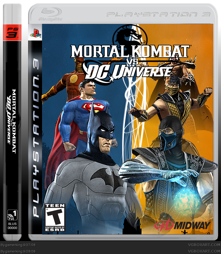
It's definitely going in the right direction.
[ Reply ]
thanks #2, but to be honest, i'm not in the mood to do all that. lol. but thanks for the advice!!
and actually batman's not stretched, that was how the pic was, but whatever. lol.
Edited at 1 decade ago
[ Reply ]
#3, Then somebody else stretched him, lol. He looks kinda long. (Honestly, I can't stand what Midway did with his costume anyway...looks too patchwork.)
If you decide to revisit it, maybe add a back, I'll most likely fav it.
[ Reply ]
okay, thanks!! I'll probably make a back tonight.
[ Reply ]
looks really cool joe. can't wait for this game!!
[ Reply ]
okay, i played around with my box and came up with this. i think it made it much better, especially since you can seen the logo better. what do you think?
[ Reply ]