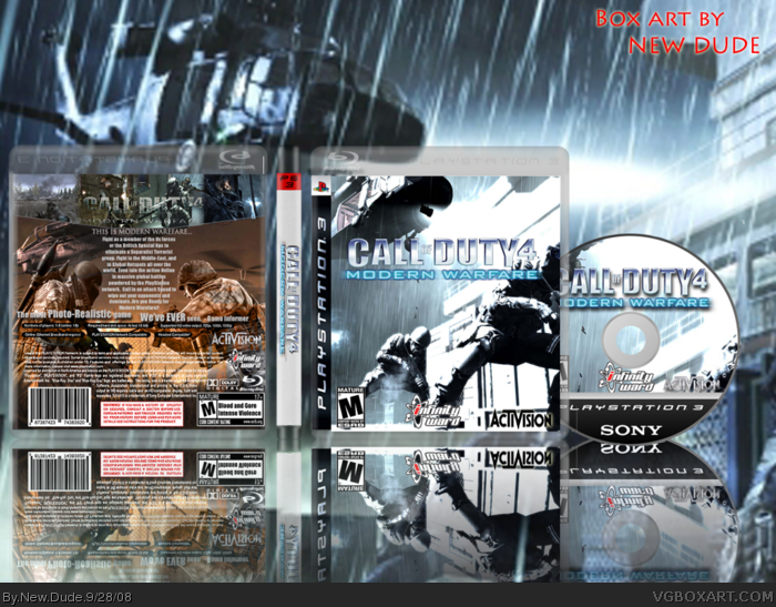
[ Box updated on September 28th, 2008 ] [ original ]
 Call of Duty 4: Modern Warfare Box Cover Comments
Comment on New Dude's Call of Duty 4: Modern Warfare Box Art / Cover.
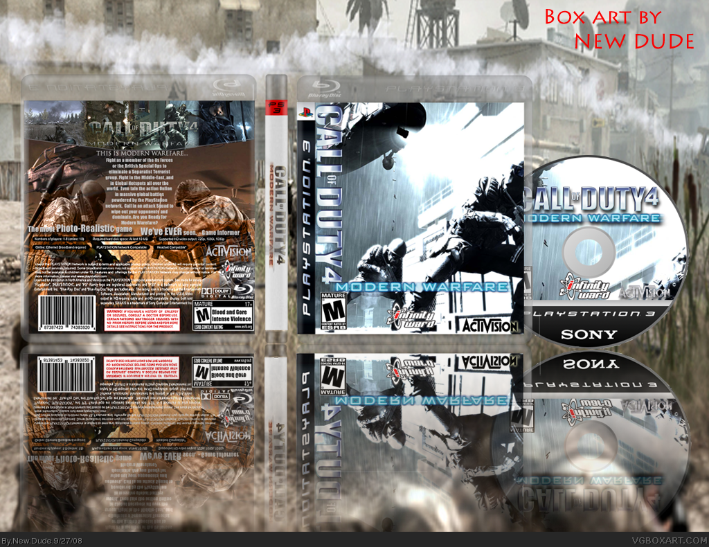
[ Box updated on September 28th, 2008 ] [ original ]
Comment on New Dude's Call of Duty 4: Modern Warfare Box Art / Cover.
Credit to Shadow the Hedgehog for the COD4 LOGO in blue. Planet Renders and Google for images and to those helpful comments in critiques. Thank you.
[ Reply ]
Too much space around the box, it distracts you and you don't focus on the box that well.
[ Reply ]
Updated! New Background, larger box!
[ Reply ]
Don't mean to bump, but anyone?
[ Reply ]
to be honest, i don't like the front at all, but the back is awesome!! and the logo is pretty cool too. how'd you make it blue?
[ Reply ]
Shadow the Hedgehog made it blue, no clue how, wht does the front need.
[ Reply ]
#6, My recommendation is to revert the logo back to the original shape (the color is fine, I like it better than the green) then place it in that large area of blank space between the helicopter and the soldiers.
Also, switch out the red-toned logo in the spine with the blue one, since you have that logo anywhere else the logo appears.
Also, your blu ray case seems too invisible, I would bump up the opacity.
It's turning out pretty good!
Edited at 1 decade ago
[ Reply ]
thanks
I'll do that.
[ Reply ]
UPDATED FINAL, FULL VIEW PLEASE i wish i would have gotten that much advice in critiques but, oh well here it is, plz comment. Thank you all!
Edited at 1 decade ago
[ Reply ]
much better!! i say the only thing left is to fix the spine. it would look cooler with a black spine so that the logo is more visible, but other than that, it's really good!!
[ Reply ]
Fav good? Just kiddin thanks!
[ Reply ]
Too much presentation, not enough box. Even in full-view I can't read the back. The images you chose for the front and back don't match very well. I'd like to see a more consistent colour theme in the images. Right now the box feels a bit random and chaotic, but not in a good way. It's a good start, and I really like the disc design, but I think it still needs some work. Just my two cents. :)
[ Reply ]
#4, What you mean you don't mean to bump? Yes you do otherwise you wouldn't have done it. Anyway onto the box, I agree with GlowBlue.
[ Reply ]
awesome 4/5 why are you banned?
[ Reply ]
he obviously can't answer that. xD
[ Reply ]
hey men i really like your cod4mw cover!
it's very beautifull
and i loved to have this cover on my box to!
could you mail this cover to [email protected]
that would be great and i hope you dont mind it
cya mate
[ Reply ]