Sorry for posting two boxes in one day but i finished this a long time ago and this was my only chance to get it posted. Credit to Koopa Dasher for template!
Don't know if you'll do something about it, but I'll give you a laundry list of things that need fixing.
------------------
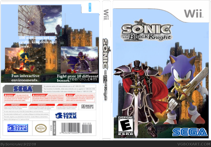
*Odd placement of screens.
*Horrible, small, monochrome logo.
*Way too much free space on front.
*Text needs drop shadows or darkened strokes in order to be more visible.
*Too many Sonic Team logos on back.
*FreeFoto.com watermark on back and partially hidden on front.
*Using the same image on front and back for background.
Clean up these issues and you might end up somewhere nice with this design.
Hey, I'm sorry if I sounded mean before, I must have been in a bad mood. But if you fix all the things I've mentioned, I'm sure people wouldn't say "Not another Sonic and the Black Knight box"
needs more editing. the font on the back should be a different color because it's somewhat unreadable when talking about the top one. i recommend using programs like gimp or photoshop for editing images,.
 Sonic and the Black Knight Box Cover Comments
Sorry for posting two boxes in one day but i finished this a long time ago and this was my only chance to get it posted. Credit to Koopa Dasher for template!
Edited at 1 decade ago
[ Reply ]
Next time, take more time on your box.
Don't know if you'll do something about it, but I'll give you a laundry list of things that need fixing.
------------------
*Odd placement of screens.
*Horrible, small, monochrome logo.
*Way too much free space on front.
*Text needs drop shadows or darkened strokes in order to be more visible.
*Too many Sonic Team logos on back.
*FreeFoto.com watermark on back and partially hidden on front.
*Using the same image on front and back for background.
Clean up these issues and you might end up somewhere nice with this design.
[ Reply ]
not enother sonic and the black knight box
[ Reply ]
#3, i hate when people always say not another....
it's so annoying
[ Reply ]
Hey, I'm sorry if I sounded mean before, I must have been in a bad mood. But if you fix all the things I've mentioned, I'm sure people wouldn't say "Not another Sonic and the Black Knight box"
[ Reply ]
needs more editing. the font on the back should be a different color because it's somewhat unreadable when talking about the top one. i recommend using programs like gimp or photoshop for editing images,.
[ Reply ]